Therapists intentionally select colors to guide your nervous system toward balance before you’re even consciously aware of the shift. Cool blues and greens activate your parasympathetic response, lowering cortisol and heart rate, while warm hues like yellow and orange reignite energy and optimism when you’re feeling flat. They’ll also use soft neutrals to quiet an overstimulated mind. Every choice reflects your unique emotional needs, and there’s much more to discover about how these healing hues work together.
Why the Colors Around You Shape How You Feel
Every color in your environment sends a signal your body reads before your conscious mind catches up. Red quickens your heartbeat and sharpens alertness through autonomic nervous system activation. Yellow stimulates serotonin production, lifting your mood and sharpening focus. These aren’t abstract ideas, they’re measurable shifts happening inside your body every moment.
Your personal history and cultural background also shape how you experience color. A shade that soothes one person might unsettle another based on memory alone. Understanding color psychology emotional control means recognizing this deeply individual response. Brightness and saturation influence your emotional state just as powerfully as hue itself, brighter tones correlate strongly with pleasure, while high saturation heightens arousal. Research has also shown that green alleviates stress and enhances a sense of calmness, making it a frequently recommended color in therapeutic environments. You’re already responding; awareness simply gives you choice.
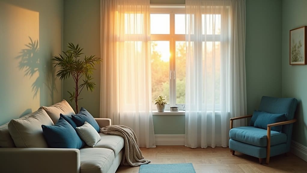
How Blue and Green Soothe the Nervous System
When you step into a room painted in soft blue or surrounded by green, your body begins responding before you even form a thought about it. Blue activates your parasympathetic nervous system, lowering cortisol, blood pressure, and heart rate within minutes. Your brain reads it as safety.
Green works differently, it restores mental energy, improves working memory, and reduces emotional overwhelm through deep nature associations. Research identifies it as the most relaxing color in psychology. Color psychology and mental health can significantly influence our daily lives and overall well-being. Understanding these connections allows for practical applications, such as using specific colors in environments to enhance mood and promote relaxation.
Together, these colors trigger dopamine and serotonin release, shifting your brain waves toward calm, focused states. This is why color and emotional regulation therapy relies heavily on cool tones. They don’t just change how a room looks, they change how your nervous system operates inside it. Pairing these calming hues with intentional mindfulness practices amplifies their therapeutic effects, creating even deeper shifts in emotional regulation over time.
Warm Hues That Lift Mood and Spark Energy
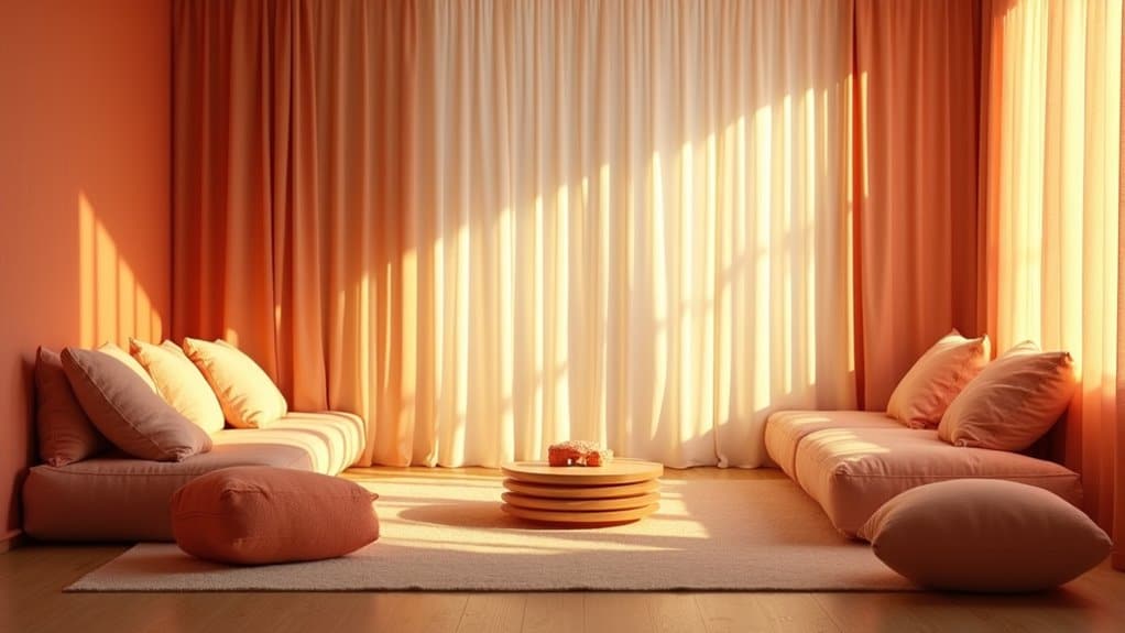
While cool tones calm your nervous system down, warm colors do the opposite, they wake it up. Red increases your heart rate and blood pressure, creating a state of physiological arousal. Orange blends that energy with playful creativity, encouraging social connection. Yellow, the color of sunshine, sparks optimism, lifts your spirits, and stimulates mental clarity.
Understanding how therapists use color for emotional regulation means recognizing that warm hues serve a specific purpose. If you’re experiencing low energy, emotional flatness, or withdrawal, these colors can gently reignite liveliness. A sunshine-yellow accent or soft orange detail in a therapeutic space isn’t random, it’s intentional. Your therapist carefully calibrates saturation and brightness, ensuring warm tones energize you without overwhelming your system.
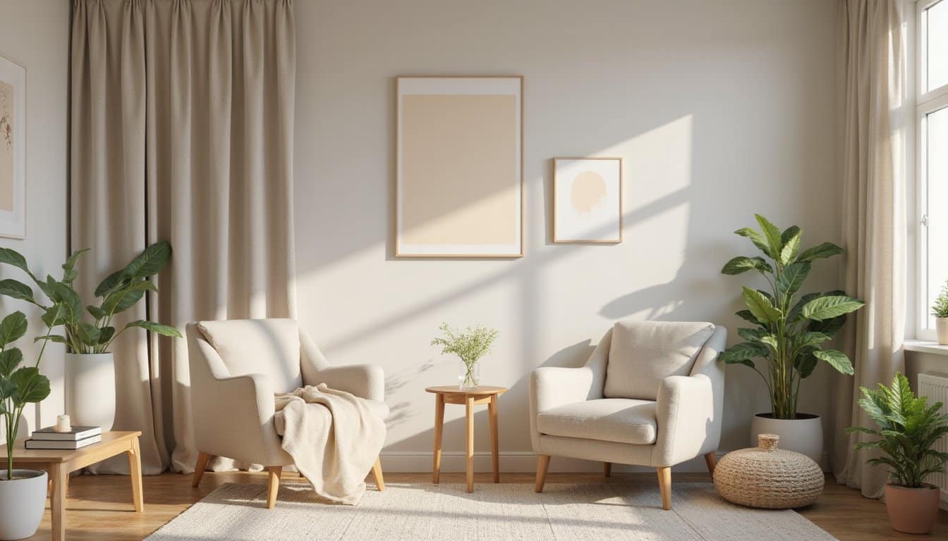
Neutrals That Help Overstimulated Minds Reset
When your mind feels flooded by too much sensory input, the visual world around you can either amplify that overwhelm or gently ease it. Soft neutral tones work like a quiet exhale for your nervous system, stripping away the emotional visual noise that keeps you locked in a state of heightened alertness. By surrounding yourself with muted, organic hues, you’re giving your overstimulated brain permission to soften its grip and begin resetting toward calm.
Reducing Emotional Visual Noise
In environments where every color competes for attention, overstimulated minds struggle to find a moment of stillness, and that’s precisely where neutrals step in. Whites, beiges, and greys quiet the visual setting, allowing your nervous system to decompress. These calming colors in therapy sessions steady fluctuating moods by stripping away competing stimuli that heighten emotional reactivity. Incorporating healing space color design can enhance the therapeutic environment even further. By thoughtfully selecting hues that promote tranquility, spaces can be transformed into sanctuaries for relaxation and reflection.
When your mind’s overwhelmed, neutral tones act as a psychological reset button. Grey’s unemotional presence prevents unnecessary triggers, while beige grounds your visual processing in warmth and safety. White opens space for clarity without clutter. Together, they form an environment where you’re not fighting sensory overload, you’re supported by it. This intentional reduction of emotional noise gives you room to self-regulate, reconnect, and restore balance from the inside out.
Calming Overstimulated Nervous Systems
Because overstimulated nervous systems can’t distinguish between real threats and sensory overload, soft neutrals offer a direct path to physiological calm. When your brain processes fewer competing visual signals, your parasympathetic nervous system activates, easing you out of fight-or-flight mode.
Therapy techniques using color leverage specific neutral combinations to reset your system:
- Soft blue + warm white lowers stress and supports wind-down responses
- Sage green + beige grounds your focus while connecting you to natural environments
- Lavender gray + cream provides gentle cues that quiet overstimulated minds
- Dusty rose + mushroom promotes warmth, safety, and social ease
These low-saturation palettes reduce cortisol levels by up to 18%, directly easing your stress response. You’re not just seeing calm, you’re physiologically experiencing it.
How Therapists Choose Colors for Each Session
Your therapist doesn’t select colors at random, they’re intentionally matching each hue to the emotional goals of your session, whether that’s grounding after a difficult week or building capacity for deeper exploration. They also watch how you respond to the environment, noticing shifts in your body language, breathing, and overall ease that reveal what’s working for you. This ongoing attunement between color choice and your lived experience guarantees the space evolves alongside your healing.
Matching Colors To Goals
When therapists prepare for a session, they don’t simply pick colors at random, they match each hue to the emotional and cognitive goals that’ll guide your work together. This intentional pairing guarantees your environment actively supports your healing process.
Your therapist may select:
- Blue or green tones as colors that reduce anxiety emotions, slowing your body’s stress response and encouraging emotional stillness
- Yellow accents to sharpen your mental clarity during cognitive-behavioral work requiring sustained focus
- Warm orange or red elements to activate your creative energy when you’re working through low motivation or passivity
- Neutral whites and beiges to quiet emotional noise when you’re feeling overstimulated
Each choice reflects your unique therapeutic objectives, creating a space where color becomes a purposeful ally in your regulation journey.
Observing Individual Responses
Though general color principles offer a strong starting point, your therapist doesn’t stop there, they watch *you*. They notice how you settle into a space, whether certain tones ease your breathing or heighten your tension. Your body language, vocal shifts, and energy levels all become data points that shape the environment around you.
This attentive observation means your therapeutic space isn’t static. If cool blues feel distant rather than calming, your therapist adjusts. If warm neutrals ground you more effectively, they lean into that discovery. Achieving emotional balance through color becomes a collaborative, evolving process between you and your practitioner.
Over time, these personalized choices create a space that feels uniquely yours, one that supports your regulation goals and honors the way your nervous system genuinely responds.
Where to Place Color in a Therapy Environment
Because color placement matters just as much as color choice, understanding where to introduce color in a therapy environment can shape the entire emotional experience of a session. You’ll want to reflect on how the color impact on mood regulation shifts depending on where it resides in the room.
Where you place color in a therapy space shapes how deeply it supports emotional regulation.
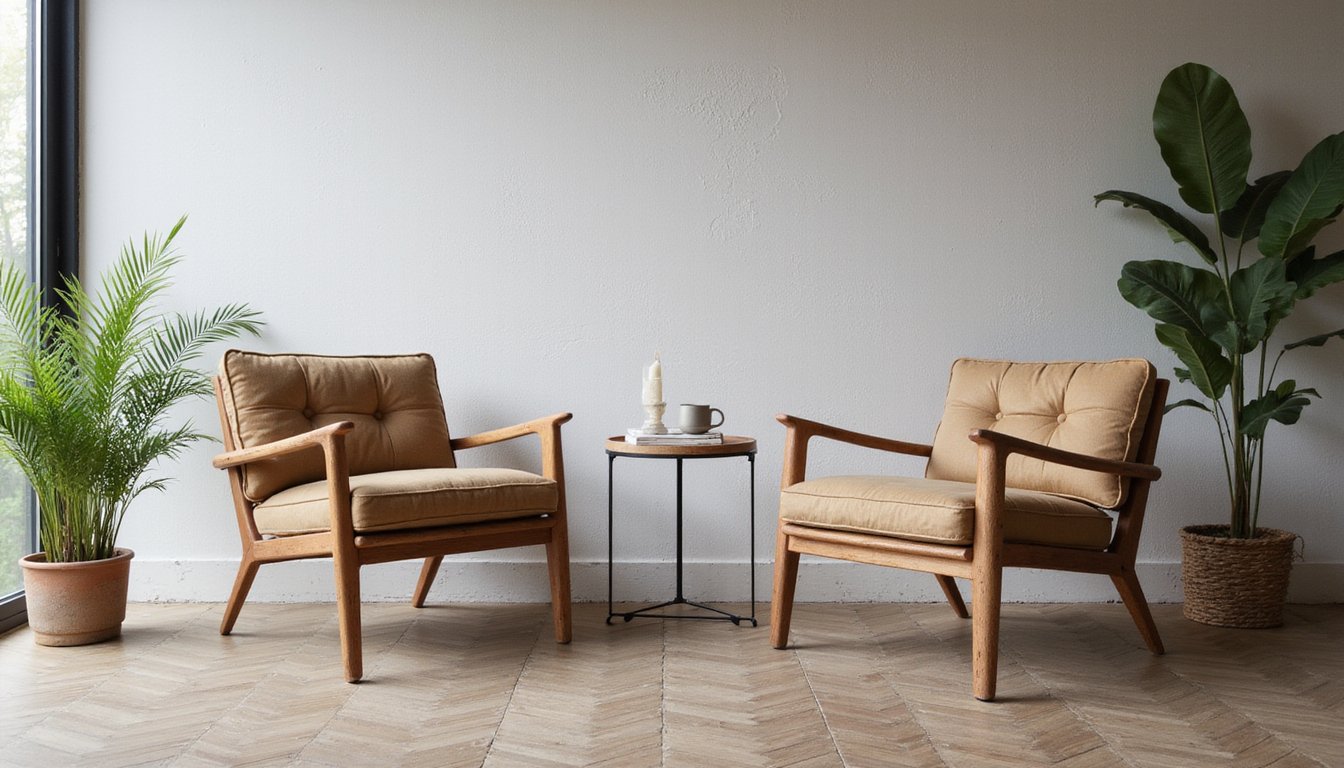
- Walls and primary surfaces, Soft tones like sage green or dusty blue create an immediate sense of calm when you enter the space.
- Floor-to-wall connections, Contrasting colors at the base help you navigate the room with ease, especially if you experience processing difficulties.
- Accent pieces, Throw pillows, planters, and artwork let you thread intentional color throughout without overwhelming the senses.
- Natural elements, Nature scenes and plants bring grounding, nature-based color that supports your emotional balance holistically.
How to Discover Which Colors Support Your Healing
Knowing where to place color in your therapy space is only part of the picture, the deeper question is which colors actually speak to *you*. Your responses to color are shaped by personal history, cultural associations, and even evolutionary wiring, so no universal rule applies.
Start by noticing how specific hues make your body feel. Does soft blue slow your breathing? Does warm yellow lift your mood? These observations matter more than any chart.
In mental health therapy color use, experimentation is crucial. Try color breathing, visualizing a chosen hue as you inhale, and track your emotional shifts. Over time, repeated pairing with relaxation practices strengthens neural pathways that support regulation. You’re fundamentally training your nervous system to respond to color as a healing cue. The impact of color on anxiety treatment can vary greatly from person to person. Some individuals may find that certain colors evoke feelings of calmness and safety, while others might react differently.
Call Now and Get the Help You Need
Anxiety has a way of making everyday life feel heavier than it should but real relief is within reach when you have the right people beside you. At Villa Healing Center, we provide Anxiety Treatment built around your needs to help you find lasting peace. Serving individuals throughout Los Angeles County, our compassionate team is ready when you are. Call (888) 669-0661 today and take the first step toward healing.
Frequently Asked Questions
Can Color Therapy Replace Medication for Anxiety or Depression Treatment?
Color therapy can’t replace medication for anxiety or depression treatment. It’s best understood as a complementary tool that supports your emotional well-being alongside conventional care. While calming colors and mindful coloring activities can help you reduce stress and manage symptoms, they don’t address the underlying neurochemical imbalances that medications target. You’ll experience the greatest benefits when you integrate color therapy into a broader, professionally guided treatment plan tailored to your unique needs.
How Long Does It Take for Color Therapy to Show Results?
You may notice subtle shifts in your emotional state during your very first session, as certain colors can immediately influence how you feel. However, deeper, lasting changes in emotional regulation typically unfold over several weeks of consistent practice. Your therapist will tailor the approach to your unique needs, adjusting colors and techniques as you progress. Everyone’s journey is different, so trust the process and honor your own pace of healing.
Are Color Therapy Benefits Supported by Scientific Research or Clinical Studies?
Yes, clinical studies strongly support color therapy’s benefits. Research shows that combining coloring therapy with conventional treatment greatly reduces anxiety in GAD patients (p = .001). You’ll find evidence confirming blue environments activate your parasympathetic nervous system, lowering heart rate, while green tones restore cognitive energy. Studies demonstrate measurable improvements in depression, negative mood reduction, and positive emotion enhancement, all without adverse effects. These findings validate what you’re experiencing as genuinely therapeutic.
Can Color Preferences Change as Emotional Healing Progresses Over Time?
Yes, your color preferences can absolutely shift as you heal. Colors you once found overwhelming might become comforting, while shades you previously ignored may suddenly resonate deeply. This evolution reflects your nervous system’s changing needs, you’re naturally gravitating toward what supports your current emotional state. That’s why client-centered approaches explore your unique color associations throughout therapy, honoring that your relationship with color is as dynamic and beautifully evolving as you are.
Is Chromotherapy Safe for Children and Individuals With Sensory Processing Disorders?
Chromotherapy’s generally safe, but you’ll want to approach it carefully if you or your child experience sensory processing challenges. Intense or energetic colors like red can overstimulate your nervous system, increasing hyperactivity and disrupting focus. Lighter shades of blue and yellow work better for promoting calmness. If you’re managing conditions like epilepsy, photosensitivity, or light-triggered migraines, you should consult your healthcare provider before beginning any color-based therapeutic work.