The colors in your therapy space affect your clients’ nervous systems before you even speak. Cool blues and greens lower blood pressure, reduce cortisol, and activate the parasympathetic nervous system, while earth tones like soft beige and taupe create a grounding sense of stability. Research shows thoughtful color design can improve recovery rates by up to 10%. By understanding how specific palettes influence physiology and behavior, you’ll create environments that support deeper emotional safety and healing.
Why Color Matters More Than Furniture in Therapy Spaces
When most people picture a therapy office, they think about the couch, the lighting, or the layout of the furniture. But color reaches your nervous system before you consciously evaluate a single piece of décor. Bright, saturated walls demand more cognitive processing, triggering restlessness and difficulty focusing, especially if you’re managing anxiety or trauma. Subdued palettes reduce that sensory load, allowing your brain to downshift and engage in emotional reflection.
Research in color psychology safe spaces confirms this: red walls produce more dysphoria than blue-green alternatives, and appropriate color design has accelerated recovery rates by up to 10%. Color sets the emotional tone before a session even begins, shaping whether you feel guarded or genuinely safe. Because perception occurs before language, clients are already forming impressions of emotional safety based on the visual environment well before rapport with a therapist is established.
The Science Behind Color, Stress, and Pain in Therapy Rooms
Although color preferences might seem purely subjective, your body responds to different hues in measurable, physiological ways. Blue and green tones lower your blood pressure, pulse, and respiration rate, while reds increase these stress markers. Soft greens and blues activate your parasympathetic nervous system, helping you shift from hyperarousal to calm. Conversely, warm colors like red can raise blood pressure and heart rate, increasing overall physiological arousal in therapeutic settings.
Research on calming therapy environment colors extends into pain management. Green light exposure boosts your body’s natural opioids and reduces inflammation signaling in the brain. Studies show this effect occurs even in color-blind patients, confirming it’s physiological rather than psychological. A 2022 postoperative trial found patients in color-enriched rooms reported markedly higher quality-of-life scores, with hospitals seeing recovery improvements up to 10%. The impact of color in therapeutic environments cannot be overstated. Different colors can invoke varying emotional responses, which can significantly influence patient outcomes.
How Cool Blues and Purples Calm Anxious Clients
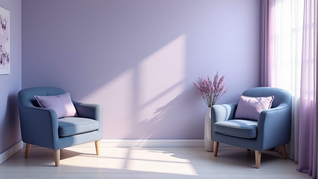
Because your nervous system responds to color before your conscious mind even registers it, the blues and purples in a therapy room do measurable physiological work. Light blue lowers blood pressure and heart rate while activating your parasympathetic nervous system. Soft purples reduce cortisol levels and encourage introspection without overstimulation. Together, these safe space colors anxiety therapy professionals rely on create environments where you can process emotions more clearly. Colors trigger reactions in the limbic system that can alter physiological states like heart rate and cortisol levels before you even become aware of the shift.
Cool tones work on your nervous system before you even realize it, calming your body so your mind can open.
These hues produce three distinct behavioral outcomes:
- Deeper relaxation, blue slows breathing patterns and eases you into a calmer state
- Greater emotional openness, purple supports safer self-exploration and strengthens therapeutic alliance
- Improved cognitive clarity, both colors reduce stress hormones, helping you think more effectively during sessions
Cool tones don’t just decorate, they actively regulate your stress response.
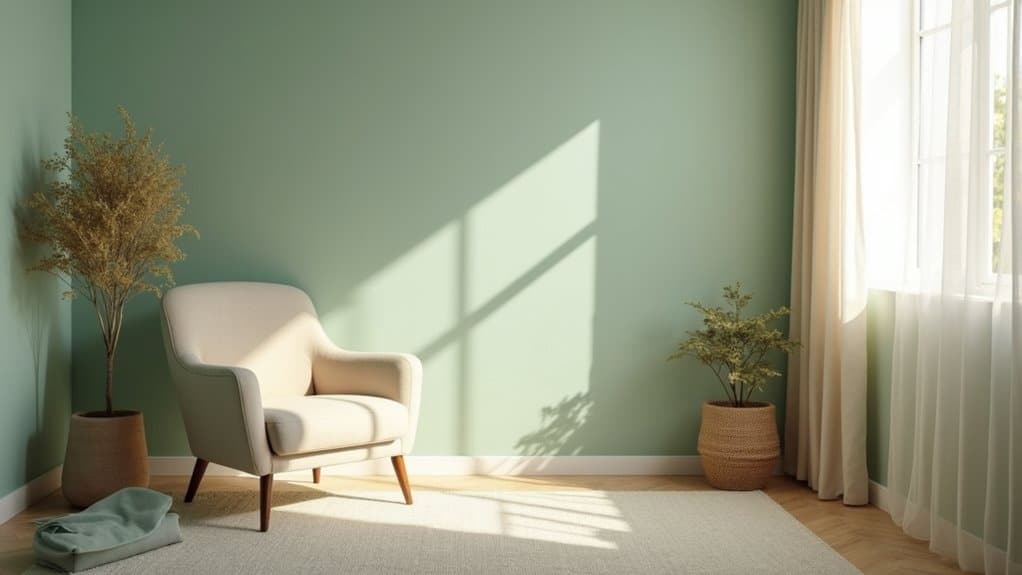
Earth Tones That Ground Clients in Therapy Spaces
Cool blues and purples regulate your stress response from the top down, but earth tones work differently. They anchor you through familiarity, mimicking the natural environments your nervous system already associates with safety. Sand tones, soft beiges, and warm taupes create stable backdrops that support emotional processing without sensory overwhelm.
Earth tones that ground clients in therapy spaces rank among preferred interior colors, following blues and greens in client preference studies. A warm taupe base with muted blush accents works particularly well for trauma-informed practice, signaling safety through a naturally grounded aesthetic. When you pair these palettes with natural wood elements, you reinforce that grounding effect measurably. Adding plants reduces cortisol levels by up to 20%, strengthening the calming foundation earth tones establish.
Why Green Supports Healing and Calm in Therapy Rooms
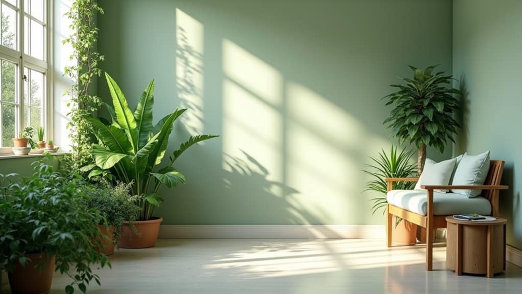
When you introduce green into a therapy room, you’re working with a color that sits at the middle of the visible spectrum, naturally reducing eye strain and lowering visual fatigue during emotionally demanding sessions. Research in healthcare settings shows that exposure to green environments can decrease pain medication requirements and shorten recovery times, giving your clients a physiological advantage as they process difficult emotions. By incorporating green tones intentionally, you create a space that reinforces themes of growth and renewal, helping clients associate their healing journey with forward movement and resilience.
Green Reduces Eye Strain
Green light sits at roughly 550 nanometers, the center of the visible spectrum, making it the most restful color for human eyes to process. With 45% of your cone cells tuned to detect green wavelengths, green’s ideal wavelength for retinal processing means your brain expends minimal effort to interpret it, reducing visual fatigue considerably.
This color influence on safe environment design matters in therapy spaces where you need sustained comfort. Green shades also absorb UV rays and cut glare that triggers strain.
To protect your eyes and maintain calm focus, consider these practices:
- Position green objects at least 33 centimeters away for immediate visual relief.
- Follow the 20-20-20 rule using green scenery for ideal effectiveness.
- Incorporate green elements that exercise eye muscles at varying distances, preventing fatigue.
Nature’s Soothing Pain Relief
The natural world offers a powerful form of pain relief that therapists can bring directly into their treatment rooms. Research shows that when you’re exposed to green environments, your cortisol levels drop, your blood pressure lowers, and your parasympathetic nervous system activates within 20 minutes. This makes nature’s soothing pain relief a practical tool in color in therapy room design.
| Green Exposure Benefit | Measurable Outcome |
|---|---|
| Pain medication needs | Reduced in patients with green views |
| Blood pressure | Lowered through nature exposure |
| Cortisol levels | Decreased stress hormone production |
| Heart rate | Balanced through parasympathetic activation |
| Hospital stay duration | Shortened with nature-visible rooms |
You don’t need a forest, plants, green tones, and nature imagery deliver measurable physiological benefits that support your healing process.
Growth Through Healing Spaces
Beyond its measurable physiological benefits, green holds a unique position in the visible spectrum that explains why it’s so effective in therapy rooms. It bridges warm and cool colors, creating visual harmony that reduces strain on your eyes and nervous system simultaneously.
When therapists focus on creating calming environments for anxiety, green supports three behavioral outcomes:
- Emotional openness, You’re more likely to explore difficult feelings when surrounded by colors that signal safety and renewal.
- Stress regulation, Green activates your parasympathetic nervous system, lowering cortisol and promoting recovery.
- Grounded presence, Natural associations with growth and balance help you stay connected to the present moment.
Green transforms therapy spaces into environments where healing feels both accessible and sustainable.
When to Use Warm Colors Without Overwhelming Clients
When you incorporate warm colors like soft yellows or muted oranges, you’ll want to use them as strategic accents, think throw pillows, artwork, or a single feature wall, rather than saturating an entire room. This deliberate restraint keeps the space energizing without triggering the physiological arousal that intense warm tones can provoke in anxious clients. You’ll find these accents work best in activity-oriented spaces like family playrooms, rehabilitation areas, and pediatric therapy gyms, where gentle warmth supports engagement, motivation, and interpersonal connection.
Strategic Accent Color Placement
Accent colors shape how a therapy space feels, but they require careful placement to support rather than disrupt the therapeutic process. When you’re selecting calming colors for therapy settings, prioritize muted, desaturated hues that place fewer demands on your clients’ attention. Soft terracotta, dusty blue, and olive green add warmth without triggering nervous system strain.
Apply accents with intentional restraint using these guidelines:
- Limit scope, introduce color through cushions, rugs, artwork, or plants rather than dominant surfaces.
- Protect visual hierarchy, accents shouldn’t compete with eye contact or emotional processing.
- Vary subtly, suggest a palette rather than a uniform color to maintain interest without overstimulation.
When uncertain, don’t add more color. Simplicity reduces accidental triggering.
Activity Spaces Benefit Most
Though accent colors work best with restraint in most therapy settings, activity spaces are where warm tones earn their place. In pediatric units, rehabilitation centers, and group interaction areas, you’ll find that soft yellows and orange accents boost creative energy and encourage social engagement. These spaces require stimulation that relaxing colors for therapy settings alone can’t provide.
The key is moderation. You should pair warm accents with calming foundations to prevent overstimulation.
| Space Type | Recommended Warm Accents | Calming Foundation |
|---|---|---|
| Pediatric Activity Rooms | Soft yellows, pastel oranges | Greens, pastel blues |
| Group Therapy Lounges | Warm neutrals, earth tones | Soft blues, cool whites |
| Rehabilitation Centers | Strategic yellow highlights | Blue-green base palette |
Color Zoning: Picking the Right Palette for Each Room
Because each area within a therapy space serves a distinct purpose, assigning specific color palettes to different zones helps occupants intuitively understand what’s expected of them as they move through the environment. When you select therapy room calming colors, you’re creating behavioral cues that reduce the need for verbal prompting during shifts.
Color-coded zones act as silent guides, helping occupants navigate therapy spaces and shift between activities without verbal prompting.
Consider structuring your zones using these evidence-based assignments:
- Blue zones for cognitive tasks like reading, where focus and concentration are priorities.
- Green zones for calming activities, promoting self-regulation and lower-stimulation engagement.
- Yellow zones for interactive learning, offering visual distinction that signals higher-energy participation.
This color-coded navigation supports independence, helping occupants, especially children, recognize spatial expectations and transition between activities with greater ease and confidence.
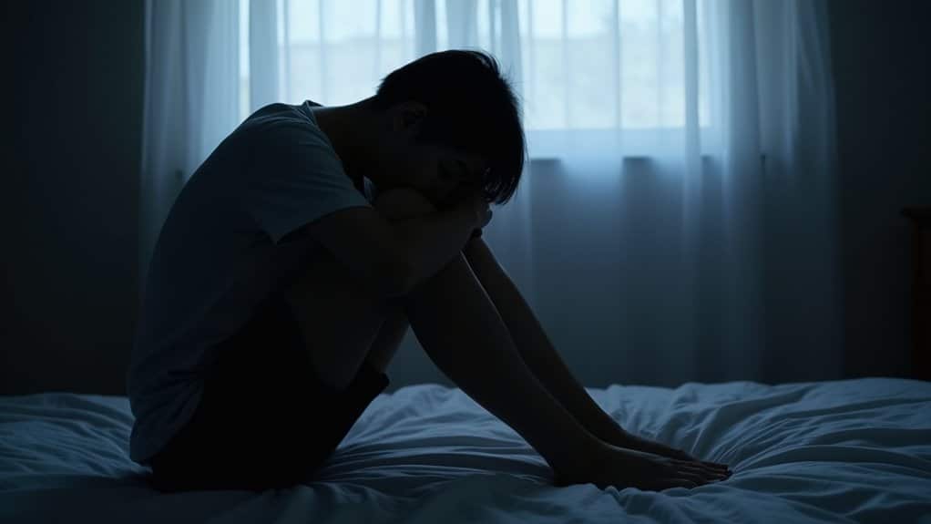
Call Now and Get the Help You Need
Anxiety has a way of making everyday life feel heavier than it should but real relief is within reach when you have the right people beside you. At Villa Healing Center, we provide Anxiety Treatment built around your needs to help you find lasting peace. Serving individuals throughout Los Angeles County, our compassionate team is ready when you are. Call (888) 669-0661 today and take the first step toward healing.
Frequently Asked Questions
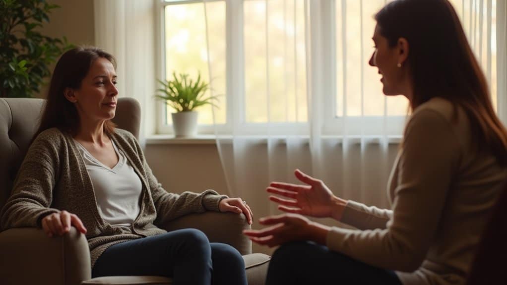
Can Clients Choose Their Preferred Therapy Room Color to Enhance Treatment Outcomes?
You can benefit from choosing your preferred therapy room color, as personal color preferences influence your comfort and emotional safety. When you feel a sense of control over your environment, you’re more likely to engage openly in treatment. Research shows that colors affect your heart rate, stress levels, and mood, so selecting a space that resonates with you can enhance your sense of trust and support better therapeutic outcomes.
How Does Artificial Lighting Change the Effect of Wall Colors?
Artificial lighting directly changes how you perceive wall colors in a therapy space. Light wavelengths interact with surface pigments, shifting how colors appear to your eye. For example, amber lighting helps you feel calmer, while blue or red lighting can increase feelings of tension and confusion. You’ll notice that highly saturated light reveals pure wall colors, whereas desaturated light creates muted tones, affecting your emotional response throughout treatment.
Should Therapy Room Colors Be Adjusted for Children Versus Adult Clients?
Yes, you should adjust therapy room colors based on your clients’ ages. Children respond well to soft pastels like light blue and pastel green, while you can use deeper, more mature tones like muted navy or forest green for teenagers and adults. You’ll want to avoid excessive white across all age groups, as it triggers anxiety and medical associations. Color-coded zones also help children shift between therapeutic activities more independently.
How Often Should Therapy Spaces Be Repainted to Maintain Calming Effects?
You should repaint your therapy space every two to three years to maintain its calming effects. Lighter, soothing colors like sage green and dusty blue fade faster, especially near windows where UV exposure dulls pigments. Frequent cleaning also wears down surfaces over time. Using mid-tone, low-VOC commercial-grade paints helps extend durability. Regular repainting preserves the emotional safety clients associate with your space, reinforcing trust and keeping the therapeutic environment consistently supportive.
Do Cultural Backgrounds Significantly Change How Clients Respond to Therapy Room Colors?
Yes, cultural backgrounds can greatly shape how you respond to therapy room colors. What feels calming to one client may feel unfamiliar or unsettling to another based on cultural associations and lived experience. That said, research shows soft blues, greens, earth tones, and muted neutrals tend to translate well across diverse populations. You’ll create the safest environment by choosing broadly calming, non-symbolic colors and evaluating each client’s cultural context early in treatment.