The color combinations in your living space directly affect your heart rate, cortisol levels, and nervous system activation. Highly saturated reds and intense yellows elevate stress responses, while soft blues can lower anxiety by up to 15% within 20 minutes. Saturation matters more than the color itself, muted, desaturated tones soothe without overstimulating. Pairing choices like sage green with cream or powder blue with warm white create therapeutically grounding environments. Understanding how lighting, zoning, and layering interact with these palettes will help you build a truly calming home.
Why Certain Colors Trigger Anxiety at Home
How colors affect anxiety in living spaces depends on saturation, quantity, and your individual sensitivity. Red accelerates heart rate and respiration. Excess yellow induces frustration. Even white walls without grounding textures heighten alertness. Incorporating cool tones like blue and green can promote a refreshing atmosphere, as these hues are known to lower blood pressure and reduce anxiety. Choosing calming interior colors combinations means balancing shade, texture, and context to support genuine relaxation.
Colors That Make Anxiety Worse in Your Space
While the previous section explored why certain colors trigger anxiety, understanding which specific colors and combinations intensify that response gives you practical power over your environment. Red tops the list, 73% of study participants link it to anger, and it physically elevates heart rate. Intense yellow overstimulates your nervous system, fueling anxiety quickly during prolonged exposure. Grey promotes emotional detachment and depression, lacking nature-based anchoring. Brown in large quantities can appear stark and lonely, reinforcing feelings of depression and anxiety in living spaces.
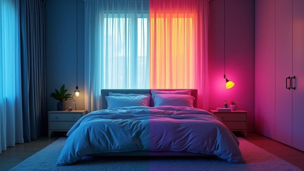
The color influence on mood home anxiety deepens with problematic color combinations. Black paired with yellow mimics nature’s danger signal, while bold red against bright white generates visual tension. These pairings amplify individual color sensitivities. Replacing them with calming color combinations for home use, soft, low-contrast palettes, directly counteracts restlessness and supports emotional regulation in your daily spaces.
Why Saturation Matters More Than the Color Itself
When you’re managing anxiety through color, saturation levels matter more than whether you choose blue, green, or yellow, research shows that highly saturated colors trigger elevated arousal and stress responses regardless of hue. Pure, intense colors create visual fatigue and increase cognitive load over time, compounding anxiety even when the color itself is theoretically calming. By shifting to muted, desaturated tones, think soft ochres instead of bright yellows, or dusty blues instead of electric ones, you maintain each color’s psychological benefits while eliminating the overstimulation that drives anxious responses. This principle is rooted in how color perception begins in the hypothalamus, where different wavelengths directly trigger hormonal shifts that amplify or diminish stress.
Muted Tones Reduce Stress
Muted tones soften your environment without stripping it of character. They lower physiological arousal, heart rate, cortisol, muscle tension, by avoiding the overstimulation that vivid hues trigger. You’ll make fewer errors, sustain attention longer, and maintain emotional equilibrium more easily.
Calming colors work best when they signal safety. Soft earth tones, pale grays, and gentle pastels tell your brain the environment is stable, encouraging groundedness rather than hypervigilance. The result is enduring clarity, not just momentary relief. Creating a healing environment for mental health can further enhance the sense of security and peace. Gentle lighting can also play a crucial role, softening the atmosphere and reducing stress.
Intensity Triggers Anxiety Responses
Highly saturated colors activate your sympathetic nervous system, elevating heart rate, blood pressure, and cortisol. They also demand greater cognitive processing, compounding distress if you’re already anxious. That’s why soothing colors for anxiety spaces rely on muted, desaturated palettes. When considering interior color combinations mental health, prioritize softness over specific hues. Your nervous system responds to visual intensity first, color second.
The Most Calming Blues and Greens for Anxiety
Blue and green sit at the foundation of nearly every calming color palette, and research confirms what your nervous system already senses, these hues actively lower stress at a physiological level. Light blue stimulates your parasympathetic nervous system, dropping anxiety levels by 15% within 20 minutes. Sage green reduces cortisol while restoring mental energy after demanding tasks. Lighting and color psychology anxiety can also be addressed through the careful selection of environments. Choosing spaces with warm lighting and soft hues can create an atmosphere conducive to relaxation and focus.
When exploring the best color combinations for anxiety, pair powder blue (#AFC7E2) with warm white (#F5F1EA) or sage green (#68855C) with cream (#FFFDD0). These relaxing color schemes for anxiety create nature-linked grounding that steadies your entire nervous system. Effective home color design for anxiety places these tones in bedrooms, bathrooms, and living rooms, spaces where your body needs permission to decompress.
Warm Tones That Comfort Without Overwhelming
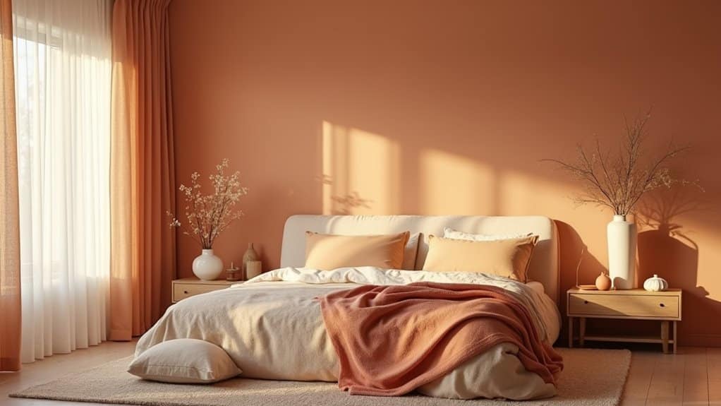
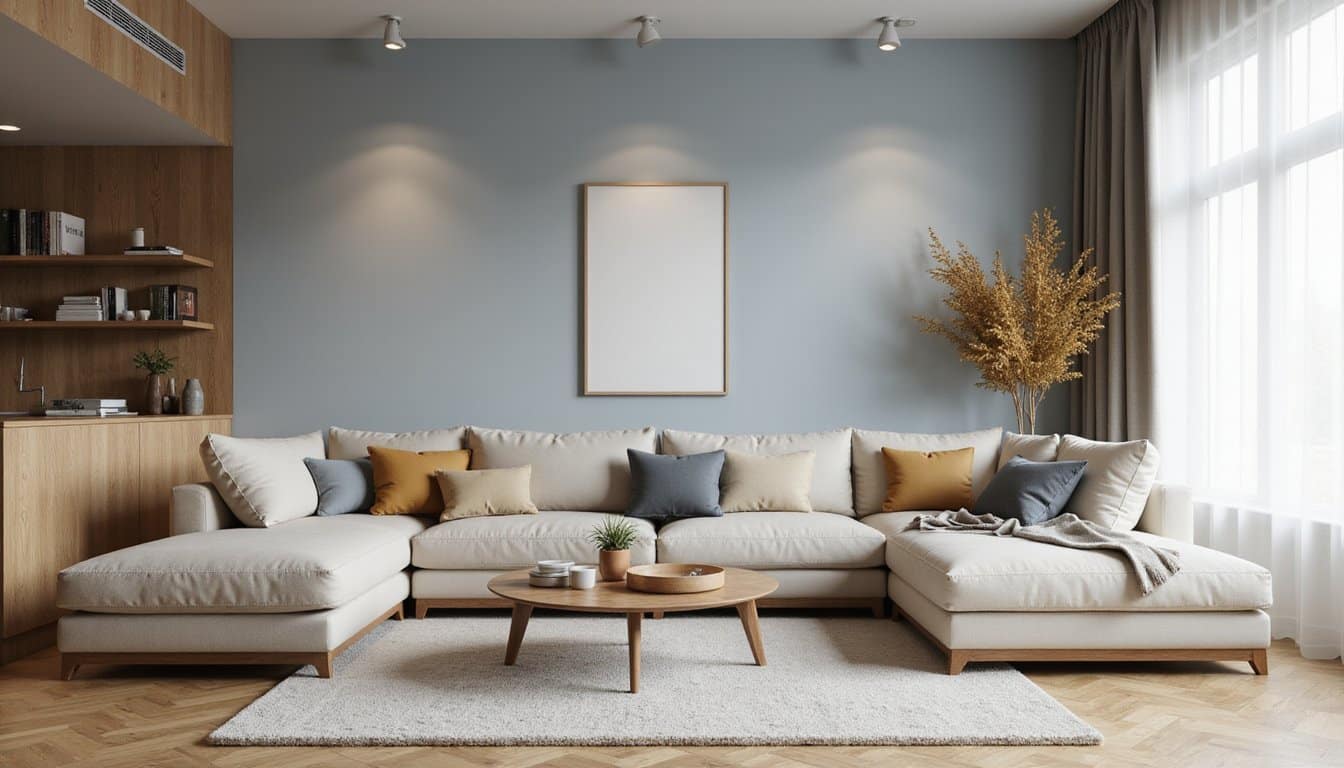
While cool blues and greens anchor most calming palettes, warm tones, ivory, sand, camel, and soft taupe, offer a different kind of relief that’s equally powerful for anxiety-prone spaces. These muted neutrals convey warmth without overstimulating your senses, creating sophisticated backdrops that feel embracing rather than chaotic.
The key to effective color pairing anxiety relief with warm tones lies in saturation control. You’ll want muted shades on larger surfaces like walls, reserving richer accents, rust, ochre, amber, for small doses through accessories or artwork. This layering prevents the closed-in feeling that concentrated warm tones can trigger.
Natural textures strengthen this approach. Linen, wool, rattan, and varied wood tones distribute warmth across tactile dimensions, reducing your reliance on color intensity alone while maintaining a cohesive, calming environment.
Unexpected Color Pairings That Promote Calm
Beyond the predictable blues and greens that dominate most calming-space guides, certain unexpected color pairings can settle your nervous system just as effectively, sometimes more so. Consider marigold combined with blush pink and navy, a trio that moves beyond traditional bold-neutral formulas while creating genuine harmony.
Gray-blue undertones paired with warm wood tones build sanctuary spaces without feeling cold. Soft teal anchored by walnut and brass prevents chilly atmospheres while maintaining soothing qualities. Muted aubergine grounds your space without overwhelming you after long days.
What makes these pairings work isn’t paleness, it’s tonal richness with subtle saturation. Peachy walls paired with gray-green undertones in layered arrangements feel serene without visual busyness. Even small tone shifts determine whether your room feels energizing, balanced, or ready for rest.
Best Calming Colors for Bedrooms and Bathrooms
When you’re choosing colors for bedrooms and bathrooms, blue consistently emerges as the strongest evidence-backed option for reducing anxiety. Powder blue and blue-gray tones like Sherwin Williams’ Krypton lower heart rate and blood pressure, creating clean, restorative environments. Sage green offers a versatile alternative, grounding spaces with its earthy gray-green base without overpowering your senses.
Consider these three calming combinations for personal spaces:
- Sky blue walls with warm neutral accents, prevents the sadness excessive blue can trigger while maintaining tranquility
- Sage green paired with creamy off-white, delivers nature-inspired calm with minimalist balance
- Soft gray alongside quiet violet tones, thought to lower stress hormones, particularly effective in bathrooms
You’ll find warm neutrals like taupe and oatmeal adapt seamlessly across design styles, promoting restful sleep naturally.
How Lighting Affects Calming Colors in Your Home
The calming colors you’ve chosen for your walls won’t perform as expected if your lighting works against them. Warm white bulbs (2700K, 3000K) enhance creamy, peach, and yellow undertones, making soft wall colors feel inviting and cozy. Cool daylight bulbs (5000K) emphasize blue and gray undertones, which can strip warmth from your palette and create a clinical atmosphere during evening hours.
Brightness matters equally. Brighter light intensifies the emotional impact of colors, while low light maintains emotional steadiness without dulling the space. Aim for at least 600 lumens to prevent a dreary feel, and use lampshades to diffuse harshness.
If your home lacks natural light, full-spectrum lamps emulate sunlight’s benefits, improving mood and helping your calming color choices reach their therapeutic potential.
Creating Calm Zones in Open Floor Plans With Color
When your home lacks traditional walls to separate spaces, you can use color zoning, strategic shifts in hue and tone, to define distinct functional areas that support your emotional needs. By adjusting saturation levels per zone, keeping softer, muted tones in rest areas and slightly richer accents in social spaces, you create psychological boundaries that guide your nervous system toward calm without visual overwhelm. Layering calming shade alterations between these zones, through gradual shifts in textiles, furnishings, and decor rather than abrupt color changes, guarantees a seamless flow that feels cohesive and soothing as you move through your space.
Color Zoning Without Walls
Open floor plans offer flexibility and spaciousness, but without thoughtful color planning, they can also feel visually chaotic, a quality that tends to heighten anxiety rather than ease it. Strategic color zoning helps you define functional areas without physical barriers, creating a sense of order that supports emotional regulation.
Here’s how to establish calm, distinct zones using color alone:
- Anchor with a dominant neutral. Choose a warm neutral, like taupe or oatmeal, as your primary color across the largest surfaces to create visual continuity and flow.
- Introduce subtle accent shifts. Use a complementary accent from the same color family to distinguish gathering areas, such as a deeper shade near the dining space.
- Blend changes gradually. Shift between lighter and darker tones of one hue to maintain cohesion while defining boundaries.
Saturation Levels Per Zone
Once you’ve established distinct zones through color shifts and tonal layering, the next consideration is how intense those colors should be. Highly saturated colors generate energy but can become overwhelming in large doses, particularly in spaces where you’re seeking calm. Softer, desaturated versions of those same hues deliver similar psychological benefits without the sensory strain.
In zones designated for rest or decompression, you’ll want to lean toward muted saturation. Warm neutrals, mushroom, taupe, oatmeal, muddy greige, create cozy ambience without triggering overstimulation. These tones absorb visual tension rather than amplifying it.
For transitional spaces or active zones, you can introduce slightly higher saturation, but restraint matters. The goal isn’t eliminating color, it’s calibrating intensity to match each zone’s emotional function, ensuring your open floor plan supports balance rather than anxiety. Consider incorporating colors for calming bedroom settings to promote relaxation and tranquility. Soft hues can create a serene atmosphere, helping to reduce stress and enhance sleep quality.
Layering Calming Shade Transitions
Because open floor plans lack physical barriers, shade shifts become one of your most effective tools for defining calm zones without disrupting spatial flow. Gradient color shifts between zones reduce visual disruption, supporting your nervous system’s preference for predictable environmental patterns.
You’ll achieve the strongest anxiety-reducing effect by layering these strategies:
- Apply warm neutrals, mushroom, taupe, oatmeal, in gradual progressions across adjacent zones rather than introducing abrupt color changes that trigger visual stress.
- Coordinate dual-shade systems that let you modulate light filtration throughout the day, softening shifts between bright and dim areas.
- Use varied shade textures, woven materials in lounging spaces, smooth rollers in kitchens, to mark zone boundaries through tactile contrast rather than jarring color changes.
These layered shifts create cohesive, therapeutically grounded environments.
How to Build a Low-Anxiety Color Palette
When you’re building a color palette designed to ease anxiety, start with low-saturation, muted tones that naturally soothe the nervous system. Choose mid-to-light shades with reduced chroma for maximum calming effect. Limit your palette to three elements: one base color, one neutral, and one accent.
| Palette Role | Recommended Choice |
|---|---|
| Base Color | Soft blue or muted green |
| Neutral | Beige or light gray |
| Accent | Pale lavender or dusty rose |
| Texture | Matte finishes only |
You’ll want matte textures exclusively, they offset visual stress far more effectively than glossy surfaces. Pair your soft, neutral foundation with intentional accent placement. This structured approach creates a therapeutically sound environment that actively supports emotional regulation and reduces sensory overwhelm.
Call Now and Get the Help You Need
Anxiety has a way of making everyday life feel heavier than it should but real relief is within reach when you have the right people beside you. At Villa Healing Center, we provide Anxiety Treatment built around your needs to help you find lasting peace. Serving individuals throughout Los Angeles County, our compassionate team is ready when you are. Call (888) 669-0661 today and take the first step toward healing.
Frequently Asked Questions
Can Anxiety-Reducing Color Choices Differ Based on Cultural Background or Upbringing?
Yes, your cultural background and upbringing can shape how you respond to specific colors. While blues and greens generally promote calm across many populations, the meanings you’ve absorbed through your culture influence your emotional reactions. A color that feels soothing to you might feel unsettling to someone from a different background. You’ll create the most anxiety-reducing space when you honor your personal and cultural associations rather than relying solely on universal guidelines.
How Often Should You Repaint Walls to Maintain Calming Color Effectiveness?
You should repaint most living spaces every 5, 7 years to maintain your calming color combinations‘ effectiveness. However, you’ll need to repaint sooner if you notice fading, discoloration, or dulling, especially in rooms with strong sunlight or high humidity. Degraded colors lose the visual harmony that supports relaxation, potentially disrupting your sense of calm. By monitoring your walls for subtle shifts in vibrancy, you’re actively preserving the therapeutic atmosphere your space provides.
Do Digital Screen Colors in a Room Counteract Calming Wall Colors?
Yes, digital screens can counteract your calming wall colors. Screens emit highly saturated RGB light that your nervous system processes as direct sensory input, triggering immediate mood shifts, even without your conscious awareness. When you’re already stressed, this intensified stimulation heightens your body’s alert state, undermining the tranquility your wall colors create. You’ll want to dim screen brightness, use warm display filters, and position screens away from your most calming spaces to protect that settled feeling.
Can Calming Color Combinations Help Reduce Anxiety in Children’s Living Spaces?
Yes, calming color combinations can meaningfully reduce anxiety in your child’s living space. Pairing soft blue with warm white lowers stress and supports bedtime wind-down, while sage green with beige grounds emotions and steadies focus. Layered combinations like lavender gray and cream create gentle sleep cues without overstimulation. You’re fundamentally designing a therapeutic atmosphere, one that signals safety to your child’s brain and nurtures emotional balance through intentional, evidence-backed color choices.
Should Renters Use Temporary Color Solutions Like Removable Wallpaper for Anxiety Relief?
You should absolutely consider removable wallpaper as a practical anxiety-relief strategy. It lets you test calming color combinations, like soft blues, greens, or muted earth tones, without permanent commitment. You’ll assess your emotional response before investing further, and you won’t risk your safety deposit. Since color perception’s deeply personal, temporary solutions give you the flexibility to customize your environment until you’ve found the palette that genuinely reduces your stress and supports daily emotional balance.