The Psychology Behind Color and Emotion
When you see a flash of red, your brain doesn’t just register a wavelength, it triggers a cascade of physiological and emotional responses rooted in millions of years of evolution. Your visual cortex processes color information while simultaneously influencing arousal levels and hormone activity, creating immediate emotion color feelings before conscious thought intervenes.
Research demonstrates that longer wavelengths like red increase heart rate and physiological arousal, while shorter wavelengths like blue promote calmness. This biological foundation combines with learned associations to form emotional symbolism, you’ve paired red with danger through stop signs and warnings countless times. The way you perceive these colors depends on light reflecting off objects and stimulating photoreceptor cells called cones in your eyes, which your brain then interprets as specific hues.
Color becomes a visual language enabling emotional expression when words fall short. Through conceptual metaphor theory, you map abstract feelings onto colors: anger becomes “seeing red,” understanding becomes “seeing the light.” This understanding has roots stretching back to Goethe’s 1810 work, which first systematically explored the emotional attributes of different colors and laid the groundwork for modern color psychology.
How Brightness, Saturation, and Warmth Shift Feelings
Beyond hue alone, three measurable dimensions, brightness, saturation, and warmth, shape your emotional response to any color you encounter.
Beyond hue alone, three measurable dimensions, brightness, saturation, and warmth, shape your emotional response to any color you encounter, helping explain how calming colors in emotional wellbeing influence mood regulation and stress perception.
Brightness directly influences valence. Lighter colors consistently trigger more positive emotions, while darker tones evoke negative associations. You’ll perceive brighter environments as happier and more appealing.
Saturation controls arousal intensity. Vivid, highly saturated colors activate stronger physiological responses, your skin conductance increases, signaling heightened emotional engagement. Desaturated, muted tones register as dull, weak, or sad. Research shows that non-art students respond more strongly to saturation variations compared to those with artistic training.
Warmth determines emotional temperature. Warm hues like red, orange, and yellow feel cozier and more cheerful than cool blues and greens, which you’re likely to judge as gloomy. This explains why colored lights have been widely used in spaces designed to improve emotional comfort and relaxation.
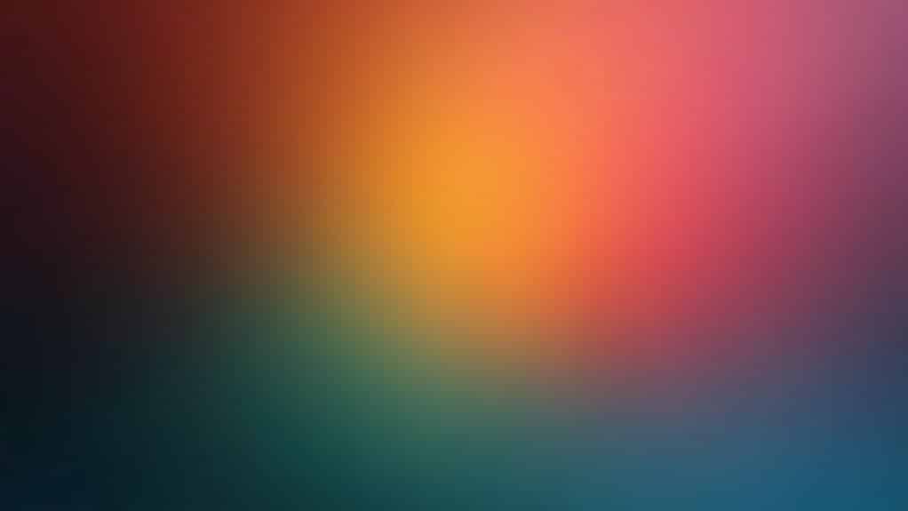
These dimensions interact powerfully. High brightness combined with high saturation and warm hues produces the most positive, arousing emotional responses, explaining why certain color combinations feel instantly energizing.
Red: Passion, Power, and Danger
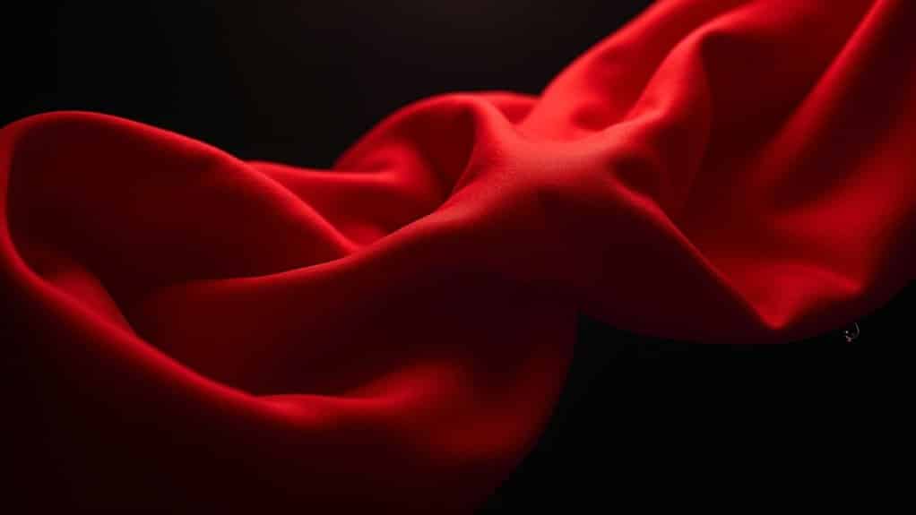
Red commands attention unlike any other color in the visual spectrum. When exploring what emotions do colors evoke, red stands apart through its dual nature, simultaneously signaling passion and danger. You’ll find this color triggers physiological arousal, increasing heart rate and heightening sensory activation. Studies using spatial cueing tasks demonstrate that red-colored images capture attention more readily than images lacking red, directing visual focus toward these stimuli.
Among colors associated with emotions, red carries the strongest links to romantic desire, power, and threat. Research shows viewing red enhances perceived attractiveness while also amplifying aggressive impulses. The emotions of colors rarely demonstrate such contradictory effects. This explains why marketers frequently use red in sales and clearance signage to trigger impulsive purchasing behavior.
Understanding colors and their emotions reveals red’s context-dependent meaning. In romantic settings, it symbolizes passion; in warning contexts, it signals danger. When examining what colors represent what emotions, red consistently represents intensity, whether that manifests as love, dominance, or urgency depends entirely on environmental cues.
Understanding colors and their emotions reveals red’s context-dependent meaning. In romantic settings, it symbolizes passion; in warning contexts, it signals danger. When examining what colors represent what emotions, the impact of colors on anxiety becomes clear, as red consistently represents intensity, whether that manifests as love, dominance, or urgency depends entirely on environmental cues.
Yellow and Orange: Energy, Warmth, and Optimism
Yellow and orange sit at the warm end of the spectrum, where you’ll find colors strongly tied to sunshine, happiness, and emotional significance. These hues stimulate high-energy psychological responses, yellow activates intellectual focus and optimism, while orange combines cheerfulness with social warmth and creative motivation. However, yellow can also evoke impatience and criticism when overused or in certain contexts. Dull shades of yellow, in particular, can trigger associations with doom, decay, and sickness, making careful shade selection essential. When you incorporate these colors into design, they function as powerful tools for making spaces feel inviting, energetic, and psychologically warmer.
Sunshine and Happiness
When sunlight streams through a window, it carries wavelengths that humans instinctively associate with warmth, energy, and emotional uplift, qualities that yellow and orange embody in color psychology. Research identifies yellow as optimistic and cheerful, linking it to mental clarity and positive mood. Orange radiates warmth and happiness by combining red’s strength with yellow’s positivity. In color psychology, orange is perceived as stimulating and friendly, which encourages openness and creativity in social settings.
The cultural meaning of these hues connects to universal experiences:
- Yellow evokes sunrise optimism and golden afternoon glows, symbolizing hopeful beginnings
- Orange represents harvest abundance and autumn celebrations across Western traditions
- Yellow-orange hues create welcoming atmospheres that encourage social connection
- Both colors signal enthusiasm and liveliness in visual communication
These sunshine associations develop through emotional memory and seasonal patterns, explaining why you instinctively respond to warm hues with feelings of cheerfulness. In Eastern cultures, yellow-orange tones carry deeper meaning, representing spiritual enlightenment and wisdom that transcends simple emotional responses.
High-Energy Stimulation Effects
Beyond their cheerful associations, yellow and orange produce measurable physiological effects that explain their classification as high-arousal colors. Research demonstrates these warm hues elevate your heart rate, blood pressure, and brain activity compared to cool colors. You’ll find yellow ranks among the most attention-grabbing colors, which explains its widespread use in caution signals and warning systems. Studies confirm that yellow and orange link to positive and high arousal emotions such as happiness and pleasure.
These stimulating properties extend to cognitive function. Yellow can enhance your mental activity and creativity, making it beneficial in environments requiring idea generation. Orange combines red’s activating qualities with yellow’s cheerfulness, promoting engaged yet playful attention without red’s aggressive edge. However, excessive exposure to intense yellow may push arousal past ideal levels, potentially triggering overstimulation and anxiety, indicating these energizing effects have suitable thresholds for productive use.
Warmth in Design
Understanding these physiological effects creates a foundation for applying yellow and orange strategically in interior spaces. Research consistently shows warm hues transform environments into welcoming, vibrant zones that encourage social connection and positive emotional responses.
You’ll find these colors particularly effective in specific contexts:
- Kitchens and dining areas benefit from yellow-orange tones that stimulate appetite and conversation
- Entryways and communal zones feel more hospitable when warmed with these optimistic hues
- Living room accents in saturated yellow or orange create vibrant havens encouraging creativity
- Social spaces gain perceived physical and emotional warmth reminiscent of sunset tones
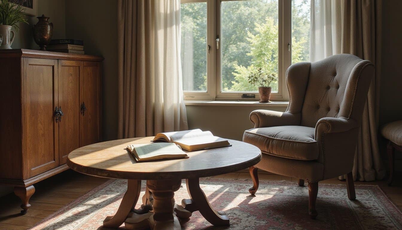
Design experts recommend pairing warm palettes with neutral bases, creams and taupes ground the energy while preserving coziness. Matte textures and natural materials like wood soften visual intensity, preventing the restlessness that overuse can trigger. For balanced interiors, the 60-30-10 rule suggests using 60% calm neutral tones, 30% supporting colors, and 10% happy accents like yellow or orange. Beyond their emotional impact, warm colors like yellow and orange tend to advance visually, making spaces feel more intimate and engaging rather than distant or cold.
Blue and Green: Calm, Trust, and Quiet Melancholy
Blue and green occupy a unique psychological space where calm meets quiet emotional depth. You’ll find blue activates your parasympathetic nervous system, slowing heart rate and lowering blood pressure. This physiological response explains why healthcare environments frequently incorporate blue tones to reduce patient stress.
| Color | Positive Associations | Potential Drawbacks |
|---|---|---|
| Blue | Trust, reliability, serenity | Coldness, emotional detachment |
| Green | Renewal, balance, vigor | Stagnation, envy |
Green connects you to nature’s restorative qualities, promoting emotional balance and healing. When combined as teal, these colors create highly soothing environments that support focus and reflection.
However, you should recognize blue’s dual nature. The phrase “feeling blue” reflects centuries of cultural association with melancholy. Overusing blue can amplify feelings of withdrawal and emotional distance. In dream analysis, blue often represents wisdom and deeper introspection, encouraging exploration of hidden emotions and spiritual insights. Research on workplace environments shows that blue’s relaxing effects can boost productivity, making it an ideal choice for offices seeking to balance calm with performance.
White, Black, and Gray: Purity, Authority, and Fear
When you consider white, black, and gray, you’re engaging with colors that carry the most polarized emotional weight in human psychology. White’s associations with purity, clarity, and new beginnings stand in sharp contrast to black’s complex dual symbolism, representing both sophisticated authority and primal fear of the unknown. This light-versus-dark dichotomy shapes how you instinctively interpret visual environments, with research showing these achromatic tones trigger stronger moral and emotional judgments than chromatic colors.
Light Versus Dark Emotions
How do the simplest colors on the spectrum, white, black, and gray, carry some of the most complex emotional weight? These achromatic tones form emotional bookends, with white representing purity and fresh starts while darker shades evoke authority and power. Gray occupies the psychological middle ground, signaling neutrality and restraint.
Research shows you’ll respond differently to light versus dark environments. White spaces promote mental clarity and calm, yet excessive brightness can trigger isolation and coldness. Darker tones command attention and respect but risk feeling oppressive.
Key emotional contrasts between light and dark tones:
- White symbolizes new beginnings; black represents endings and finality
- Light tones create spaciousness; dark tones establish intimacy
- White feels pure but potentially sterile; gray feels stable but emotionally muted
- Brightness energizes; darkness grounds
Black’s Dual Symbolism
Black occupies a unique psychological position among colors, functioning simultaneously as a symbol of commanding authority and deep-seated fear. You’ll find this duality shapes how black influences your emotional responses across contexts. When you wear black in professional settings, you project power, discipline, and sophistication. Yet the same color triggers associations with darkness, threat, and the unknown.
Black occupies a unique psychological position among colors, functioning simultaneously as a symbol of commanding authority and deep-seated fear. Colors that signify anxiety and stress help explain how this duality shapes emotional responses across contexts. When you wear black in professional settings, you project power, discipline, and sophistication, yet the same color can also trigger associations with darkness, threat, and the unknown.
| Authority Associations | Fear Associations | Protective Functions |
|---|---|---|
| Leadership and control | Anxiety and danger | Emotional shielding |
| Elegance and formality | Oppressive weight | Privacy creation |
| Premium exclusivity | Aggression signals | Identity concealment |
Black also carries cultural weight as the primary mourning color in Western societies, representing endings and grief. However, some cultures associate black with fertile soil and renewal, demonstrating how one color contains opposing emotional meanings within its symbolic spectrum.
Frequently Asked Questions
Can Colorblind Individuals Still Experience Emotional Responses to the Colors They Perceive?
Yes, you can still experience emotional responses to colors even with colorblindness. Research shows you’ll form color-emotion associations through conceptual pathways, language, culture, and learned symbolism, rather than relying solely on perceptual experience. Studies demonstrate that colorblind individuals rate emotional intensity similarly to those with typical vision. You’ll compensate by using blue-yellow signals and luminance cues, allowing you to evaluate warmth, calmness, or excitement despite altered chromatic perception.
Do Animals Respond Emotionally to Colors the Same Way Humans Do?
No, animals don’t respond emotionally to colors the same way you do. Their color vision systems vary dramatically, from dichromatic dogs to tetrachromatic birds, creating entirely different perceptual experiences. Research shows animals respond to colors primarily when they’re tied to ecological signals like mating displays or warning patterns, not abstract emotional associations. You’ve developed cultural and symbolic color meanings that other species simply don’t share, making cross-species emotional comparisons unreliable.
How Do Age and Generational Differences Affect Emotional Associations With Specific Colors?
Your emotional responses to color shift dramatically across your lifespan. As a child, you’re drawn to bright, saturated hues like red and yellow for their arousal value, while you associate dark colors with negative emotions. As you mature, you’ll develop more nuanced, context-dependent interpretations that integrate cultural and personal experiences. Generational influences also shape your palette preferences, Boomers gravitate toward stable neutrals, while Millennials embrace optimistic pastels like “millennial pink.”
Can Personal Trauma Permanently Change Someone’s Emotional Response to Certain Colors?
Yes, personal trauma can permanently alter your emotional response to certain colors. Through classical conditioning, your brain links specific hues to traumatic events, triggering anxiety or physical reactions even without conscious memory recall. These implicit associations show high resistance to fading over time. While exposure-based therapies can weaken these responses, they often remain partially intact. If structural brain damage occurs, your altered color perception and emotional reactions may become functionally permanent.
Do Digital Screens Alter How We Emotionally Perceive Colors Compared to Print?
Yes, digital screens alter your emotional perception of colors compared to print. Screens emit light using RGB, making colors appear more vivid and intense, which amplifies arousal-related emotions like excitement. Print reflects light through CMYK, producing duller tones that evoke calmer, more subdued feelings. You’ll also experience dynamic screen content as more stimulating, while print’s tactile quality reinforces perceptions of credibility and permanence, each medium shapes your emotional response differently.