Black, gray, and red are the colors most strongly linked to anxiety, stress, and nervousness in clinical research. You’ll find that individuals who prefer black demonstrate the highest Beck Anxiety scores, while 89.8% of study participants assign negative associations to gray. Red triggers physiological arousal that mimics your body’s anxiety response through fight-or-flight activation. Understanding how these color-emotion connections form through learned associations can help you make intentional choices that support your mental well-being.
Black, Gray, and Red: The Colors Most Tied to Anxiety
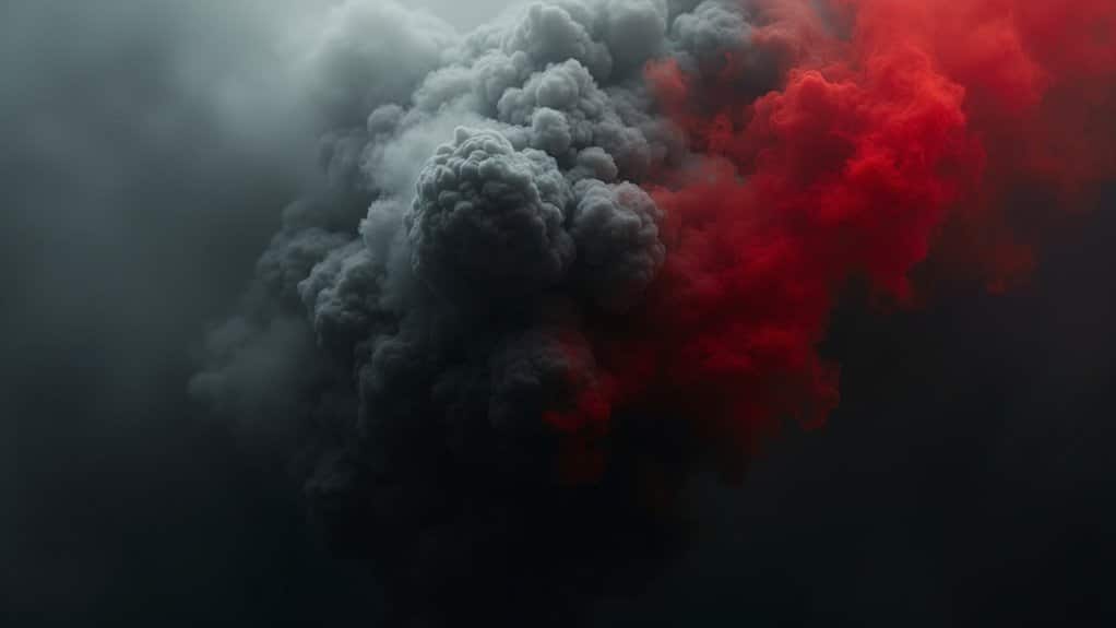
When researchers examine the psychological impact of color on anxiety, black consistently emerges as the most anxiety-linked hue in clinical studies. Participants who identify black as their favorite color demonstrate the highest Beck Anxiety scores compared to those preferring other colors. Children similarly associate black with negative emotional states, rating it among the most “angry” and “sad” colors.
Gray shares this anxious profile. Clinical data shows gray correlates with elevated depression and anxiety scores, while 89.8% of participants assign negative associations to this neutral tone. You’ll find gray most frequently categorized as “sad” in emotional-rating experiments. These connections likely stem from how our brains process facial color patterns linked to emotional states, which we then project onto our broader environment. Colors that impact emotions play a significant role in branding and marketing strategies, influencing consumer behavior more than we often realize. For instance, the vibrant hues of red can evoke feelings of excitement and urgency, prompting quicker purchasing decisions.
Red operates differently, triggering physiological arousal that mimics anxiety responses. Studies reveal red lighting produces markedly higher state anxiety scores than blue or green conditions, increasing heart rate and activating threat-response systems. Research shows that red can signal dominance and trigger instinctive responses rooted in our evolutionary biology.
Why Your Color Reactions Are Shaped by Personal History
Your emotional response to any given color isn’t hardwired, it’s shaped by learned associations formed through repeated pairings with positive or negative experiences throughout your life. Classical conditioning research confirms that neutral stimuli like colors acquire affective value when consistently linked with specific outcomes, meaning a color present during a childhood trauma or comfort can trigger similar feelings decades later. Cultural meaning differences further complicate these reactions, as symbolic associations vary considerably across societies, white signals purity in Western weddings but represents mourning in some Eastern cultures. Carl Jung was among the early psychological figures who recognized the deep connection between personality types and specific color responses. Research shows that extroverts may prefer bold and vibrant colors, while introverts often gravitate toward softer and muted tones.
Learned Color Associations
Much of what you feel when you see a particular color stems from learned associations rather than innate responses. Your color, emotion links develop through repeated pairings of specific hues with particular outcomes, messages, and contexts throughout your life. Color-in-context theory explains how social learning layers meaning onto colors beyond any biological predispositions you possess. Research has shown that non-artists convey emotions through color more effectively than trained artists, suggesting that following conventional color associations rather than breaking from them creates clearer emotional communication.
Your brain forms implicit associations when frequent exposure causes automatic activation of color, meaning connections without conscious awareness. Environmental cues, warning signs, institutional decor, brand colors, reinforce these meanings each time you encounter similar contexts. Cross-domain transfer occurs when associations learned in one setting generalize to others. For example, if red marked your mistakes in school, you may experience heightened anxiety when encountering red in workplace performance situations, demonstrating how early conditioning shapes lifelong emotional responses. These deeply ingrained reactions explain why chromotherapy uses colored lights to address emotional imbalances, as therapeutic interventions can potentially reshape learned color associations that contribute to anxiety and stress.
Cultural Meaning Differences
Beyond individual learning histories, broader cultural forces shape which colors trigger your anxiety responses. Regional symbolism & conflicting color codes demonstrate how identical hues produce divergent emotional reactions across populations.
Consider red: Western contexts associate it with danger and heightened arousal, while Chinese traditions link it to luck and celebration. Your nervous system responds based on culturally encoded meanings. Similarly, yellow represents optimism in America but signals jealousy in Germany and mourning in Egypt. Research shows that red and blue were most preferred colors among American subjects, but other cultures showed different preferences, highlighting how deeply cultural context shapes emotional color responses.
Historical trauma further conditions these responses. War-time propaganda embedded red and yellow as danger cues, while nuclear-era civil defense materials reinforced red’s association with catastrophic threat. Religious iconography depicting punishment in intense reds heightens fear-based reactivity among adherents. These color associations develop over generations through shared cultural experiences and symbolic traditions passed down within communities.
These culturally transmitted associations operate automatically, influencing your stress responses before conscious evaluation occurs.
How Dark and Dull Colors Reflect and Reinforce Anxious Moods
When researchers examine color preferences among individuals with elevated anxiety scores, a consistent pattern emerges: dark and dull colors show strong statistical associations with anxious mood states. Studies indicate you’re more likely to prefer low saturation colors if you experience heightened anxiety, as these muted hues help you avoid overstimulation.
Clinical data reveals that preferences for black, white, and gray correlate significantly with higher Beck Anxiety scores (p<0.02). You’ll find that dark colors like black carry cultural associations with burden, pessimism, and threat, cognitive cues that can amplify anxious thinking patterns. However, when used intentionally in interior design, black naturally absorbs light, which reduces reflections and distractions that might otherwise contribute to sensory overwhelm.
Dull colors reduce perceived energy and optimism in your environment, potentially reinforcing worry and hopelessness. This creates a feedback loop: your anxious state draws you toward visually blunted surroundings, which then maintain your emotionally dampened mood profile. Understanding that colors can influence mood by affecting hormone and neurotransmitter production helps explain why breaking this cycle requires intentional color intervention.
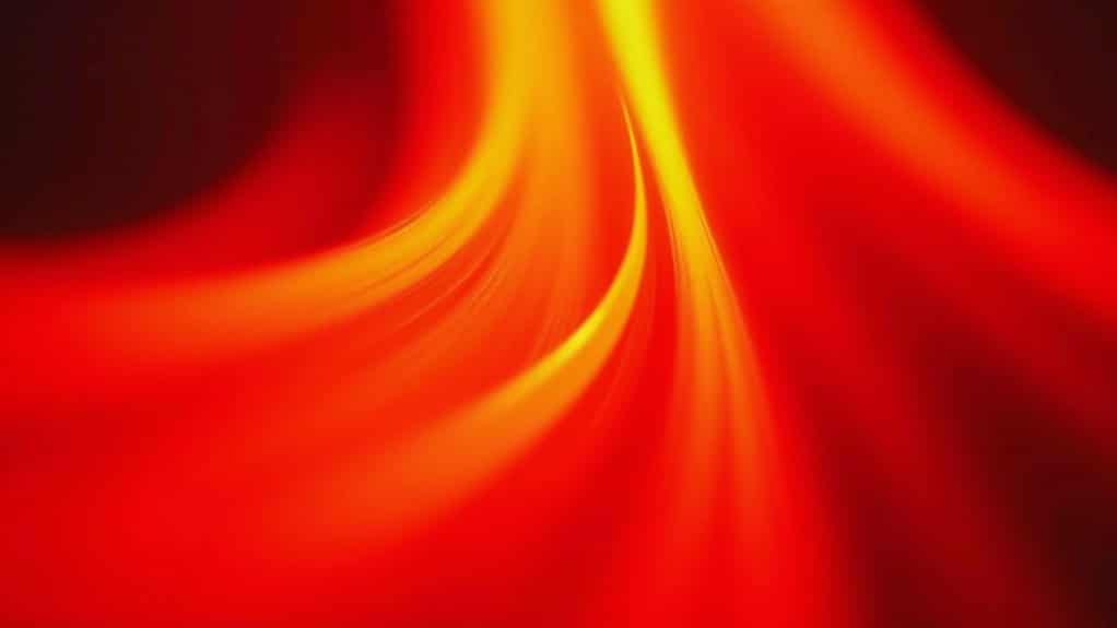
Why Red Triggers Anxiety Through Your Fight-or-Flight Response
While muted tones correlate with anxious mood states, high-intensity colors produce distinct physiological effects that directly activate your body’s stress systems. Red triggers your fight-or-flight response through evolutionary conditioning, your brain associates this hue with blood, injury, and danger cues, priming threat detection in your amygdala.
When you’re exposed to red, your sympathetic nervous system activates rapidly. Research demonstrates that red elevates your heart rate and blood pressure while stimulating cortisol and adrenaline release. These hormonal surges increase vigilance, redirect blood flow to muscles, and prepare your body for rapid action. In contrast, cool colors like blue and green can reduce cortisol levels, creating a sense of relaxation rather than heightened stress.
Red also creates visible feedback loops. Stress-induced vasodilation causes facial flushing, and noticing this redness amplifies self-consciousness. This flushing can extend beyond the cheeks to affect your neck, ears, and scalp. Your awareness of body heat intensifies perceived danger, sustaining hyperarousal and deepening anxiety sensations.
How Bright, Intense Colors Overwhelm Anxious Minds
When you’re exposed to highly saturated, intense colors like neon yellow or vivid fuchsia, your nervous system responds with measurable increases in heart rate, blood pressure, and cortisol levels. This physiological arousal compounds your existing anxiety by adding sensory stimulation to an already hypervigilant state, making emotional regulation considerably more difficult. These vibrant hues activate your attention networks and can trigger fight-or-flight responses, which is why they’re better suited for productivity rather than mental recovery. The cognitive load created by processing these stimulating hues depletes mental resources you’d otherwise use to manage anxious thoughts and maintain focused attention. In contrast, engaging with calming colors through coloring therapy has been shown to create a positive state of mind, help focus attention, and alleviate anxiety in patients with generalized anxiety disorder.
Saturated Hues Trigger Overwhelm
Because highly saturated colors demand significant visual and cognitive processing, they can rapidly overwhelm individuals already experiencing anxiety or heightened stress responses. When you’re exposed to intense hues like deep reds or vivid oranges, your sympathetic nervous system activates, increasing heart rate and blood pressure. This physiological response amplifies emotional arousal, potentially worsening symptoms in those with anxiety disorders. Notably, red triggers the fight or flight response, making it particularly problematic for those already in a vulnerable mental state.
Research indicates that saturated warm tones trigger stress-related catecholamine release, including adrenaline and norepinephrine. If you’re already in a heightened state, these colors bias your attention toward threatening stimuli, intensifying the nervousness color associations create. Clinical design guidelines recommend limiting bold, saturated hues in therapeutic environments specifically because they increase distractibility and emotional reactivity. For vulnerable populations, even brief exposure to highly chromatic stimulation can shift cognitive processing toward negative cues, exacerbating existing distress.
Stimulation Heightens Nervous Tension
Bright, intense colors don’t just attract attention, they actively tax your nervous system and amplify existing anxiety states. Research demonstrates that warm, highly saturated hues, particularly red, trigger measurable sympathetic activation, elevating your heart rate and blood pressure beyond baseline levels. The psychological effects of color choices extend beyond physical responses; they can influence moods and behaviors in profound ways. For example, cooler colors like blue and green are often associated with calmness and relaxation, which can counterbalance the effects of more stimulating colors.
This physiological stress response creates a feedback loop. When you’re already anxious, exposure to visually intense stimulation increases vigilance and threat monitoring, perpetuating worry cycles. Colors that represent anxiety often share this activating quality, overwhelming your cognitive capacity when you’re most vulnerable.
Studies confirm that high-anxiety individuals instinctively avoid shiny, stimulating colors, gravitating toward dull, neutral tones. This behavioral pattern reflects an adaptive attempt to reduce sensory overload. Your nervous system recognizes what clinical evidence supports: intense chromatic stimulation exacerbates anxiety symptoms in predisposed individuals.
What Science Reveals About Anxiety and Color Preference
You’ll find that high anxiety correlates with preferences for dull, low-saturation colors. Individuals scoring elevated on the Beck Anxiety Inventory demonstrate statistically significant preferences for neutral tones, with differences reaching p<0.02 across color temperature categories. PTSD populations conspicuously avoid red, preferring green’s lower arousal properties. These findings suggest your nervous system systematically influences color perception and preference patterns.
Calming Colors That Reduce Stress and Nervous Tension
While high-anxiety individuals gravitate toward muted, low-saturation hues, research confirms that specific color palettes actively reduce physiological stress markers. Soft blue engages your parasympathetic nervous system, lowering blood pressure and cortisol levels. Muted green demonstrates the highest efficiency for mental comfort, restoring working memory and reducing cognitive load. Muted earth tones anchor your nervous system by minimizing overstimulation.
While high-anxiety individuals often gravitate toward muted, low-saturation hues, research confirms that calming colors in mental health actively reduce physiological stress markers. Soft blue engages the parasympathetic nervous system, lowering blood pressure and cortisol levels. Muted green demonstrates the highest efficiency for mental comfort, restoring working memory and reducing cognitive load. Muted earth tones help anchor the nervous system by minimizing overstimulation.
| Color Category | Physiological Effect |
|---|---|
| Soft Blue | Reduces heart rate, lowers cortisol |
| Muted Green | Restores mental energy, promotes relaxation |
| Muted Earth Tones | Decreases sensory overload, stabilizes mood |
| Warm Amber | Fastest stress-mitigation response |
You’ll find these colors strategically deployed in therapy offices, recovery rooms, and stress-management clinics. When you’re selecting environmental colors, prioritize low-saturation palettes that don’t demand attentional resources.
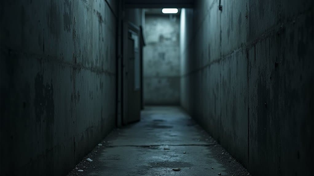
Why Gray Rooms Drain Your Energy and Spike Anxiety
Gray environments consistently trigger negative emotional responses, with research showing 89.8% of participants associate gray with adverse psychological states. When you’re surrounded by gray walls, you’re experiencing what researchers call understimulation, a stressor that produces restlessness and tension rather than calm.
Your brain requires adequate visual stimulation to maintain alertness. Gray-dominant spaces offer minimal color variation, leading to cognitive fatigue and reduced vigor. This monotonous environment limits the micro-rewards and orientation cues your mind needs to function ideally.
Prolonged gray space exposure affects your stress biology directly. Research links high exposure to gray, built environments with blunted HPA axis reactivity, a pattern associated with anxiety, depression, and emotional dysregulation. Unlike green or blue spaces that protect emotional functioning, gray surroundings amplify your chronic stress load while draining mental energy reserves.
How to Choose Low-Anxiety Colors for Your Home and Office
The solution to gray-induced understimulation lies in strategic color selection backed by psychological research. You’ll find that soft blues correlate strongly with reduced stress markers and improved concentration, making them ideal for home offices and study areas.
Soft blues reduce stress and sharpen focus, making them the science-backed choice for productive home workspaces.
Muted greens support balance and renewal, particularly effective in living rooms where relaxation is prioritized. For bedrooms, light lavender provides gentle calming effects conducive to rest and reflection.
You should consider implementing biophilic color schemes that incorporate nature-linked palettes, earthy browns, sky blues, and botanical greens. These combinations mimic natural environments and demonstrate measurable anxiety-reducing properties in clinical assessments.
Avoid overstimulating hues like neon yellows or intense reds, which increase physiological arousal. Instead, opt for low-contrast pairings and pastel variations that maintain aesthetic preference while minimizing visual tension throughout your spaces.
Take the First Step Toward Healing Today
Frequently Asked Questions
Can Wearing Certain Colors Affect Your Anxiety Levels Throughout the Day?
Yes, your clothing color choices can influence your anxiety levels throughout the day. When you wear warm, saturated colors like bright red or intense orange, you’re exposing yourself to stimulating hues that may increase physiological arousal and tension. Choosing cool colors, blues, greens, or soft teals, can produce soothing effects that help regulate your mood. Research indicates color exposure modulates stress responses, suggesting you’ll benefit from selecting calmer hues during anxiety-provoking situations.
Do Children and Adults Associate Different Colors With Anxiety and Stress?
Yes, you’ll notice developmental differences in anxiety-color associations. As an adult, you’re more likely to link black, gray, and dull neutrals with anxiety, showing measurable avoidance of bright hues. Children typically associate dark colors (black, dark brown) with fear through concrete thinking, connecting black with monsters or nighttime threats. You’ll find adolescents begin mirroring adult patterns, using black and gray to represent internal distress, while your adult associations tend toward more abstract symbolism.
Are Anxiety-Related Color Associations the Same Across All Cultures Worldwide?
No, anxiety-related color associations aren’t universal across all cultures. While you’ll find cross-cultural consensus linking warm colors like red and yellow to heightened arousal and tension, considerable cultural differences exist. You’ll observe white symbolizing mourning in China versus purity in Western contexts, and yellow representing happiness in some regions but deceit or mourning in others. Research demonstrates systematic color-emotion mapping globally, yet cultural context dramatically modulates whether specific hues evoke stress or calm.
Can Changing Your Phone or Computer Screen Colors Reduce Daily Stress?
Yes, you can reduce daily stress by adjusting your screen colors. Research shows that switching to warmer color temperatures (amber/yellow tones) lowers physiological arousal and speeds cortisol recovery after stress. You’ll also benefit from reducing blue light exposure, especially in the evening, since it disrupts melatonin production and sleep quality. Consider enabling night mode, choosing green-dominant themes, and avoiding high-saturation red interface elements to minimize stress activation.
Do Colorblind Individuals Experience Anxiety-Related Color Associations Differently Than Others?
You likely experience anxiety-related color associations somewhat differently if you’re colorblind, though research remains limited. Your reduced sensitivity along the red-green axis may blunt the chromatic salience of traditional warning colors, potentially diminishing their immediate anxiety-triggering effect. However, you’ll typically retain luminance and saturation perception, and your blue-yellow discrimination often remains intact. You’ve also learned contextual cues, shapes, patterns, positioning, that maintain functional anxiety associations despite altered hue perception.