Calming colors psychology explains how hues such as blue, green, and soft neutral tones influence emotional balance by activating the parasympathetic nervous system and reducing cortisol levels. Research shows that blue environments can lower heart rate and anxiety, while green tones help restore cognitive energy and support concentration. Muted color palettes reduce visual overstimulation, creating low-threat environments that promote mental clarity and emotional regulation. Understanding how specific colors affect the brain’s stress response can help design spaces that actively support psychological well-being.
The Most Calming Colors for Stress and Anxiety

When stress levels rise, the colors surrounding you can either amplify tension or help restore calm. Research in calming colors psychology identifies specific hues that lower sympathetic nervous system activation and support emotional regulation. colors that signify anxiety and stress can create an overwhelming environment that intensifies feelings of unease. In contrast, choosing soothing tones can foster a sense of safety and tranquility, making it easier to navigate difficult situations.
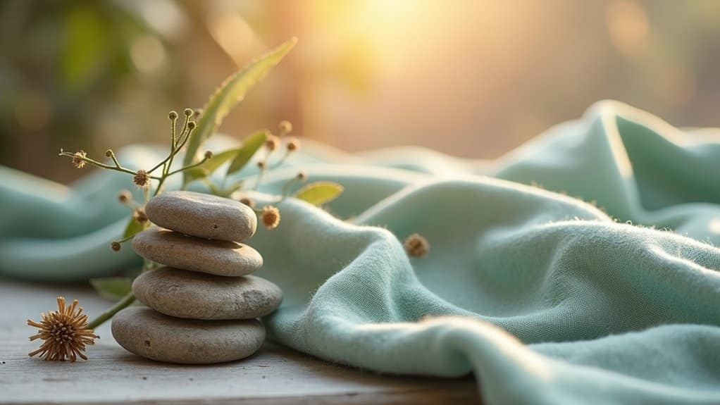
Soft neutrals like beige and warm white reduce cognitive load and visual arousal, creating perceived safety. Lavender combines blue’s tranquility with pink’s warmth, supporting cortisol reduction and rest. Muted pastels, peach, blush, soft coral, lift mood without triggering stress responses.
Soft neutrals and muted pastels create visual calm, reducing cognitive load while gently lifting mood without triggering stress.
Light gray provides a visual break, minimizing emotional reactivity and decision fatigue. Cool greige blends establish stable, predictable environments that promote equilibrium. Blue tones are particularly effective due to their calming and stress-reducing benefits for mental health.
You’ll want to avoid high-intensity warm colors like bright red or neon orange, which activate fight-or-flight responses and increase tension rather than ease it. Similarly, neon yellow should be avoided as it activates attention networks and may increase anxiety levels in those seeking calm.
Why Blue and Green Calm Your Nervous System
Because your brain evolved in natural environments, it still responds to blue and green as signals of safety and resource availability. These colors historically indicated water, daylight, and vegetation, conditions that reduced threat perception and vigilance demands.
When you’re exposed to green, your parasympathetic nervous system activates, lowering stress hormones and blood pressure. Blue similarly suppresses cortisol while enhancing calming neurotransmitter pathways. Research measuring heart rate and brain activity confirms these physiological shifts. Green specifically balances the nervous system, promoting both calm and restoration simultaneously.
Understanding what color represents calm requires examining neural responses. Blue and green increase alpha brain wave activity, associated with relaxed wakefulness. These calming colors for mental health support emotional regulation without inducing drowsiness. When considering what color represents calmness, evidence consistently points to cool hues that balance alertness with genuine restoration. These natural colors facilitate soft fascination, a mental state that allows effortless attention and cognitive recovery without demanding directed focus.
Why Soft, Muted Calming Colors Feel More Relaxing
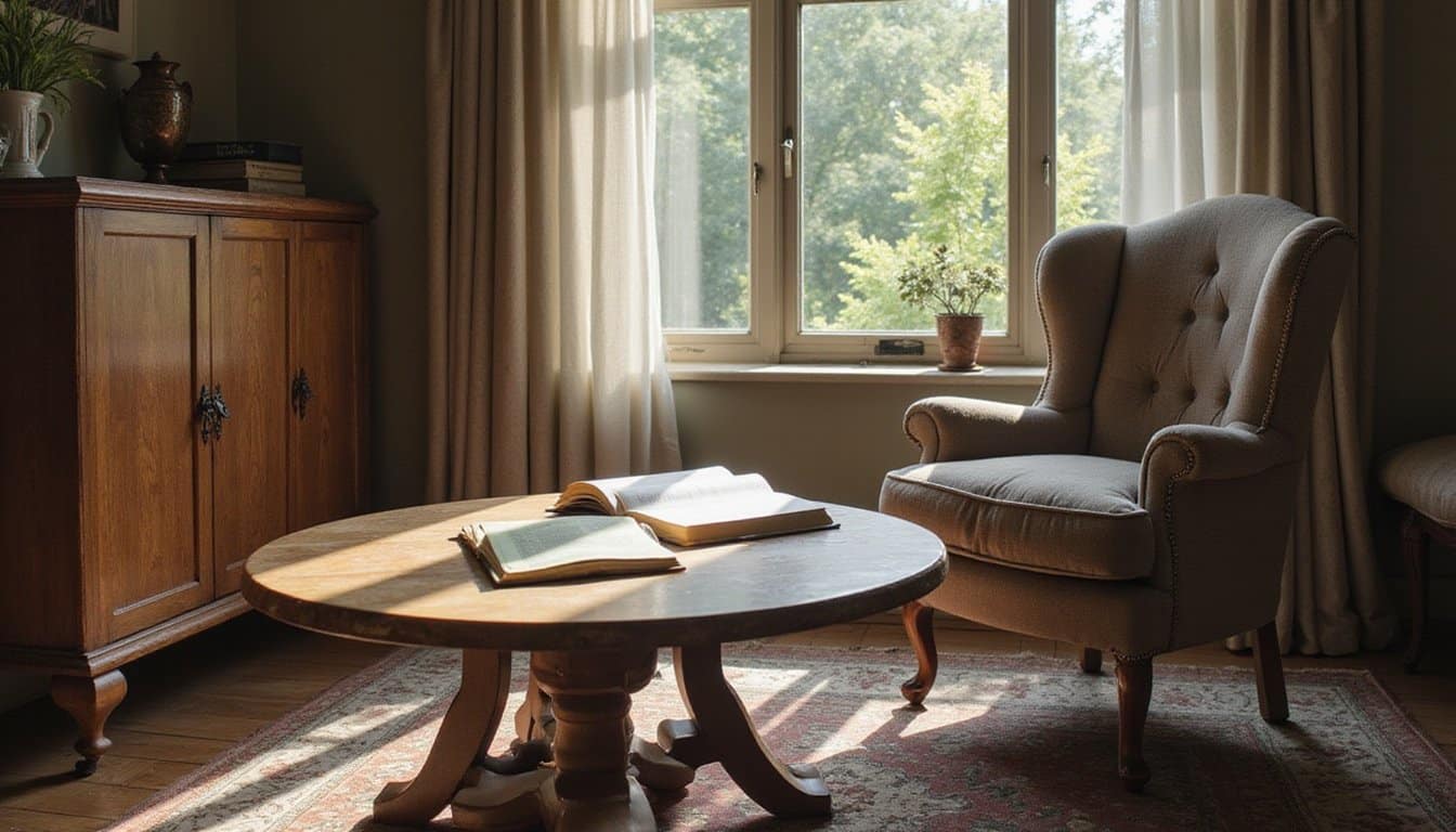
Muted palettes support emotional regulation by softening affective responses without causing numbness. Research in balance color psychology demonstrates that desaturated environments promote stress reduction through decreased cognitive distraction and enhanced focus. Your brain interprets soft earth tones and warm neutrals as safety cues, associating them with natural environments and home-like familiarity.
These gentle hues create low-threat surroundings where you can achieve mental clarity, sustained concentration, and emotional equilibrium throughout extended periods. Cool tones like blues and greens are particularly effective, as studies show they can reduce cortisol levels by up to 18%, easing stress and increasing concentration. Green is especially beneficial for reducing eye strain and maintaining energy levels during long study or work sessions.
Calming Colors That Quiet Mental Noise and Boost Focus
When you’re trying to quiet mental noise and sharpen your focus, the colors around you matter more than you might realize. Blue environments consistently enhance mental clarity and sustained attention, while green tones restore cognitive energy and support steady concentration during demanding tasks. Muted, desaturated hues reduce overstimulation by creating visual calm, freeing your mind to think more clearly without the interference of sensory overload. Research shows that exposure to blue environments can lower heart rate and reduce feelings of anxiety, further supporting a focused and relaxed mental state. This calming effect has evolutionary roots, as certain colors trigger instinctive responses that have developed over time to help humans navigate their environments safely.
Blue Enhances Mental Clarity
Though often described as soothing, blue does more than simply relax, it actively sharpens mental focus and quiets cognitive noise. Research shows you’re more productive in blue environments, with certain shades improving concentration and stimulating clear thinking. This makes blue a cornerstone of environmental therapy in workspaces designed for sustained mental effort.
Blue-enriched light activates brain areas regulating attention and arousal, enhancing your reaction time and accuracy on cognitive tasks. You’ll find blue commonly recommended for spaces requiring analytical reasoning and problem-solving because it encourages mental organization without agitation. Robert M. Gerard’s research proposed that different colors arouse different feelings and emotions, with blue having effects opposite to red’s stimulating properties like increased blood pressure and respiration.
Blue-enriched light activates brain areas regulating attention and arousal, enhancing reaction time and accuracy on cognitive tasks. Colors and their psychological effects help explain why blue is commonly recommended for spaces requiring analytical reasoning and problem-solving, it encourages mental organization without agitation. Research by Robert M. Gerard further proposed that different colors arouse distinct emotional and physiological responses, with blue producing effects opposite to red’s stimulating properties, such as increased blood pressure and respiration.
When you’re tackling knowledge-based work, blue palettes help reduce mental noise and maintain a composed, task-oriented mindset. The color supports structured thinking, making it ideal for environments where clarity and precision matter most. Blue also stimulates melatonin production, which helps regulate your sleep-wake cycles and contributes to overall cognitive restoration.
Green Restores Cognitive Energy
While blue sharpens focus through mental quieting, green takes a different path, it actively restores the cognitive energy you’ve depleted. According to Attention Restoration Theory, exposure to green environments replenishes your directed attention capacity, helping you recover from mental fatigue after sustained cognitive effort.
Green works through multiple mechanisms. It lowers cortisol levels, reducing physiological stress and freeing resources for executive functions. Neuroimaging research shows yellow-green wavelengths increase activity in your anterior cingulate cortex, a region central to cognitive control, while elevating alpha wave activity associated with relaxed alertness. This modulation also influences the hypothalamic-pituitary-adrenal axis, reducing the production of stress hormones that interfere with cognitive performance.
The practical applications are straightforward. Short micro-breaks viewing greenery enhance task persistence and accuracy. Green elements in your workspace correlate with higher reported focus and lower cognitive exhaustion. Research has demonstrated that walking in green environments induces a significant reduction in heart rate values compared to red and white conditions, corroborating green’s calming and relaxing effect on physiological functioning. You’re not just resting your mind; you’re actively rebuilding its capacity.
Muted Tones Reduce Overstimulation
Because saturated colors increase visual arousal and cognitive load, muted tones offer a quieter alternative that supports emotional regulation and sustained focus. When you’re surrounded by desaturated palettes, your brain processes fewer competing visual signals, allowing deeper engagement with tasks requiring concentration.
Research shows bright warm colors like red and orange trigger heightened physiological arousal, which can impair cognitive performance and increase tension. In contrast, soft blues, pale grays, and gentle pastels create visual environments that support calm and groundedness. This sense of stability creates emotional safety, making you more likely to take risks, ask questions, and express thoughts freely. Studies in university residence halls have demonstrated that blue color facilitated studying activity, confirming the cognitive benefits of cooler, calmer hues in learning environments.
Benefits of muted color environments:
- You’ll experience reduced anxiety and sensory overload
- Your attentional control improves, making task prioritization easier
- You’ll maintain more positive affect during sustained mental work
- Your emotional regulation strengthens through decreased stimulation
Choose desaturated tones when you need psychological quieting.
How to Use Calming Colors in Your Home and Workspace
When you’re designing spaces that support emotional balance, color choice becomes a practical tool rather than just an aesthetic preference. In bedrooms, apply soft blues or blue-greens to walls and textiles, research links blue with lower heart rates and improved sleep quality. For living rooms, combine muted greens with warm neutrals to balance social interaction with relaxation.
In workspaces, prioritize blue and green tones to reduce stress while supporting concentration. Avoid saturated reds or high-contrast pairings that increase arousal and visual tension. Instead, use soft neutrals as your base, layering calming accents gradually. Since blue is associated with relaxation and trustworthiness, incorporating it into office design can help create an environment conducive to focused, calm productivity.
In workspaces, prioritize blue and green tones to reduce stress while supporting concentration. Avoid saturated reds or high-contrast pairings that increase arousal and visual tension. Instead, use soft neutrals as your base, layering calming accents gradually. Emotional meanings of colors explained show that blue is strongly associated with relaxation and trustworthiness, making it an effective choice for creating an office environment conducive to focused, calm productivity.
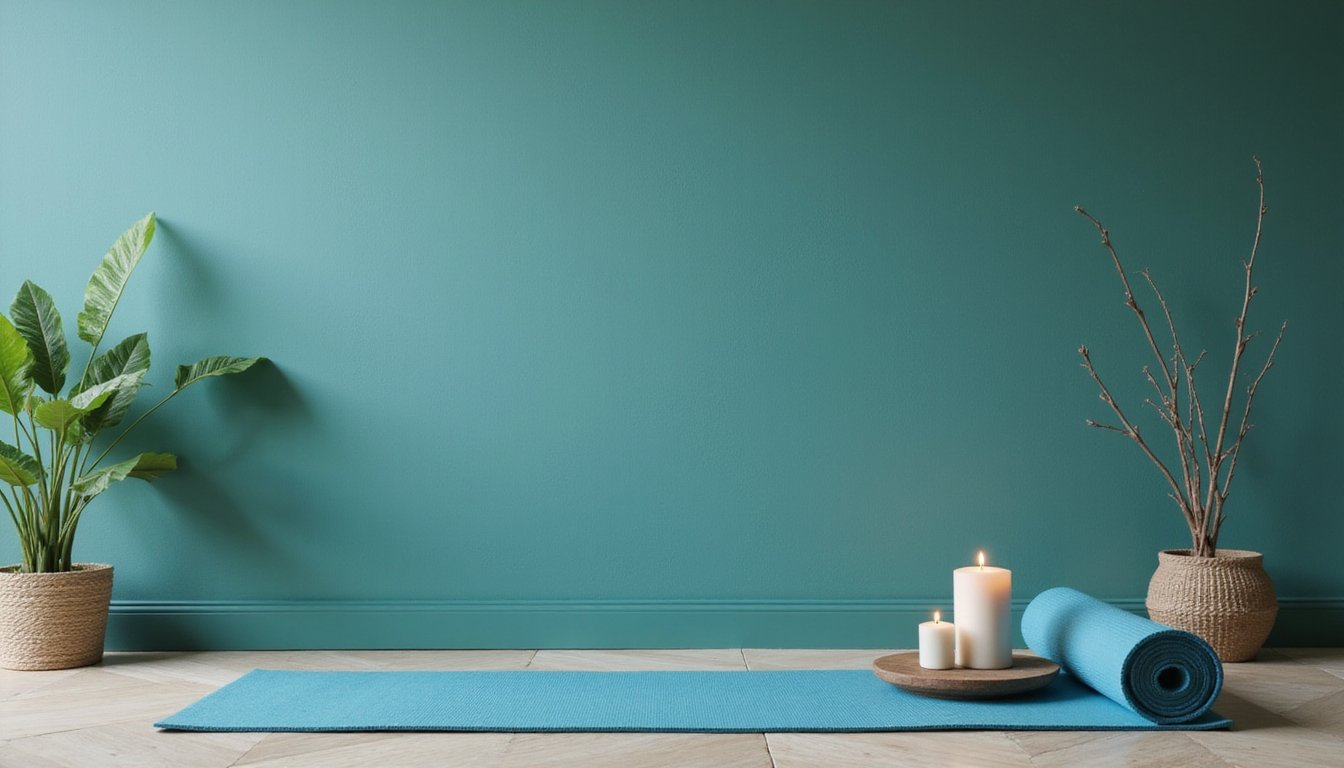
For bathrooms, consider spa-inspired palettes, pale aqua, seafoam, or stone gray, to promote freshness and calm. In children’s rooms, choose dusty blues or pastel greens to maintain playfulness without triggering restlessness or overstimulation.
How to Combine Calming Colors With Mindfulness Practices
You can deepen your mindfulness practice by pairing calming colors with intentional breathing techniques. Research in color psychology suggests that focusing on soft blue or green hues during diaphragmatic breathing reduces stress and supports clearer thinking. Using these colors as visual anchors during meditation helps train your nervous system to associate specific hues with relaxation, creating a conditioned cue that accelerates your body’s parasympathetic response over time.
Color-Enhanced Breathing Exercises
Although color psychology and breathwork each offer distinct pathways to relaxation, combining them creates a synergistic practice known as color breathing, a technique that pairs controlled diaphragmatic breathing with deliberate visualization of calming hues. This method activates parasympathetic responses while leveraging color-emotion associations to deepen relaxation.
Research links this combined approach to reduced cortisol levels, decreased sympathetic arousal, and improved emotional regulation. You’re fundamentally using colors as proxies for internal states, enhancing your ability to identify and manage emotions.
To practice color-enhanced breathing effectively:
- Settle into a comfortable position and take two to three grounding breaths
- Visualize a calming color, blue, green, or soft purple, entering your body with each inhale
- Imagine tension leaving as a darker hue with each exhale
- Maintain nonjudgmental awareness throughout the three-to-ten-minute session
Visual Anchors for Meditation
Because the mind naturally seeks a resting point during meditation, visual anchors, simple color-based focal objects, offer a concrete strategy for stabilizing attention and deepening practice. When you focus on a single-color point, such as a soft blue dot or green candle, you reduce visual complexity and limit competing stimuli that fragment concentration.
Research indicates cool hues like light blue and soft green activate your parasympathetic nervous system, lowering heart rate and blood pressure. You’ll benefit from choosing muted, low-saturation tones that minimize arousal without dulling engagement.
To operationalize this technique, select a calming anchor and return to it whenever distraction arises. Consistent use builds conditioned relaxation responses, the color itself becomes a cue for calm. Pair your anchor with structured breathing to strengthen associative learning and deepen meditative absorption.
Frequently Asked Questions
Can Calming Colors Help People With ADHD or Sensory Processing Disorders?
Yes, calming colors can help you manage ADHD or sensory processing challenges. Research shows soft, muted tones, like light blues, greens, and pastels, reduce hyperactivity, anxiety, and physiological arousal. You’ll likely find cool colors support better focus and emotional stability. Avoid bright reds, oranges, and high-contrast patterns, as they can trigger overstimulation and agitation. Combining calming colors with soft lighting and clutter-free spaces creates an environment that supports your nervous system regulation.
Do Calming Color Effects Differ Across Cultures or Age Groups?
Yes, calming color effects vary markedly across cultures and age groups. You’ll find blue and green widely perceived as restful, but cultural symbolism shapes responses, white feels peaceful in Western contexts yet signals mourning in many Eastern cultures. Your age also matters: children associate calmness primarily with light colors and brightness, while adults develop more intricate hue preferences. You should consider these differences when creating personally effective calming environments.
How Long Does Exposure to Calming Colors Take to Reduce Stress?
You can experience stress reduction within minutes of exposure to calming colors. Soft blues and greens lower your heart rate and blood pressure almost immediately, while a 20, 30 minute coloring session produces measurable anxiety decreases. You’ll notice the fastest effects with low-saturation, cool hues and warm, dimmed lighting. Repeated daily exposure over days to weeks builds cumulative benefits, helping you maintain emotional balance and clearer thinking under pressure.
Can Calming Colors Improve Sleep Quality When Used in Bedrooms?
Yes, calming colors can improve your sleep quality when you use them in your bedroom. Research shows that soft blue bedrooms are linked to the longest average sleep duration, nearly eight hours nightly, compared to stimulating colors like purple. These calming hues help lower your heart rate and blood pressure, creating physiological conditions that support sleep onset. You’ll benefit most from muted tones of blue, green, or soft neutrals.
Are Digital Screens With Calming Colors as Effective as Physical Environments?
Digital screens with calming colors can shift your mood and reduce visual stress, but they’re not as effective as physical environments. When you’re in a space with calming hues, you’re engaging multiple senses, light, temperature, acoustics, which produces stronger physiological effects like lowered heart rate and cortisol. Research shows physical environments yield more durable emotional benefits and behavioral improvements, while screen-based color effects remain shorter-term and less expansive.