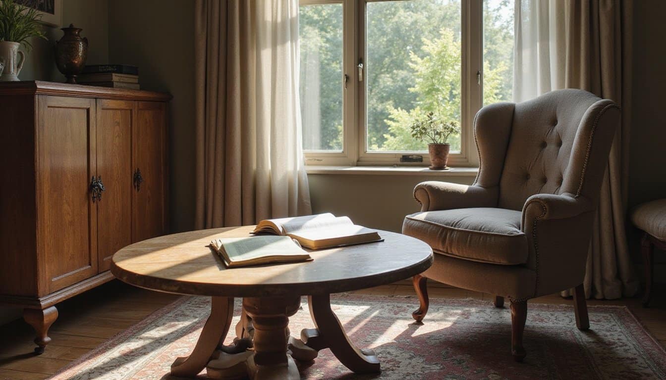
The Science Behind Color Psychology and How Our Brains Process Hues

Before your brain perceives color, specialized photoreceptors in your retina detect light wavelengths and initiate a complex neural cascade. Your retinal cone photoreceptors, S-cones detecting blue, M-cones detecting green, and L-cones detecting red, transmit signals that your brain integrates into color perception.
The opponent process theory explains how your neural pathways organize these signals into three opposing channels: blue-yellow, red-green, and black-white. This mechanism prevents you from simultaneously perceiving opposing color pairs, creating the visual effects you observe in complementary colors.
Your brain activity patterns reveal unique neural signatures for each specific hue. While your visual cortex processes initial light encoding, higher cortical areas generate your actual color experience. The transition from encoding physical light to perceptual color experience occurs in higher visual cortex areas, where your brain converts wavelengths into the colors you consciously perceive.
Wavelength-dependent effects further influence your responses, longer wavelengths produce arousing reactions, while shorter wavelengths feel calming, shaping your emotional engagement with color environments. Researchers using magnetoencephalography have successfully decoded which colors individuals perceive based on their brain activity recordings, demonstrating how the brain systematically organizes color information.
Understanding Warm Colors: Red, Orange, and Yellow’s Impact on Arousal and Energy
When you encounter warm colors, your body doesn’t simply observe them, it responds with measurable physiological changes that prime you for action and heightened engagement. Color psychology reveals how red, orange, and yellow trigger distinct arousal patterns through neurological pathways.
| Color | Physiological Response | Psychological Effect |
|---|---|---|
| Red | Increases heart rate, blood pressure, metabolism | Evokes passion, confidence, urgency |
| Orange | Combines stimulation with cheerfulness | Inspires enthusiasm, courage, liveliness |
| Yellow | Boosts serotonin production, mental focus | Promotes optimism, creativity, alertness |
The psychology of color demonstrates that warm hues universally elevate energy levels and grab attention. Understanding these psychological effects of color helps explain why warm tones enhance productivity in workspaces and motivate behavioral responses. These consistent color associations can strengthen emotional effects through repeated exposure and reinforcement.
However, excessive exposure risks overstimulation, requiring balanced application in environmental design. Color perception remains influenced by cultural factors, meaning that the emotional impact of warm colors may vary across different populations and backgrounds.
The Calming Power of Cool Colors: Blue and Green for Relaxation and Focus
While warm colors energize your nervous system through increased heart rate and mental stimulation, cool colors operate through an opposing mechanism, they actively downregulate arousal and activate your parasympathetic nervous system. Blue and green wavelengths (490-520 nm) directly reduce amygdala activity, lowering chronic stress and anxiety. This neurological response underlies color psychology’s foundational principle: cool colors facilitate emotional processing toward calmness and safety.
Environmental psychology research demonstrates that blue-green exposure enhances vagus nerve activity, promoting deep breathing and physiological balance. The psychological effects of colors extend to cognitive performance, blue optimizes focus and sustained attention, while green supports concentration during demanding tasks. Blue-green’s integration of thought and feeling creates a bridge between mental clarity and emotional awareness, allowing for more holistic processing of information. Studies show that proximity to natural blue spaces provides even greater mental and physical wellbeing benefits than artificial color exposure alone.
Chromotherapy and evidence-based design increasingly leverage these effects. By strategically applying cool colors in your spaces, you harness their documented capacity to support mental well-being and behavioral stability.
How Red Influences Performance, Competitiveness, and Decision-Making
Red’s influence on performance, competitiveness, and decision-making operates through distinct neurological and psychological mechanisms that don’t uniformly enhance or diminish your capabilities. Color psychology research reveals that red exposure increases physiological arousal and anxiety, which impairs fine motor tasks requiring precision but may support strength-based activities.
In competitive contexts, red creates perceived dominance, observers rate red-wearing athletes as more threatening and likely to win, even when performance remains constant. However, the color and psychology literature shows these effects depend critically on task complexity. Difficult, detail-oriented tasks suffer under red-induced arousal, while simple or power-oriented tasks may benefit. Research analyzing over 6,500 combat sport contests from Olympic Games and World Championships found that red clothing advantage largely disappeared after 2005, suggesting that awareness of color effects and rule changes may have neutralized initial performance biases.
Recent meta-analyses have found that publication bias may have led initial studies to overestimate red’s actual effects on cognitive performance. Color theory thus demonstrates that red’s psychological colors effects aren’t universally negative; rather, they’re context-dependent, making strategic application of color and psychology essential for optimizing performance outcomes.
Blue’s Role in Trust, Attention, and Stress Reduction
You’ll find that blue enhances your cognitive performance through multiple neurological mechanisms: blue light activates melanopsin photoreceptors that sharpen your attention and alertness, while simultaneously lowering your blood pressure, heart rate, and respiration.
This dual effect, heightened mental acuity paired with physiological calm, makes blue uniquely positioned to support both focus and emotional regulation. The evidence suggests you experience measurable improvements in sustained attention tasks and anxiety reduction when exposed to blue environments, establishing it as a powerful tool for optimizing your mental and physical state.
When you spend time in blue spaces, you’re likely to use words like secure and orderly to describe your psychological state. Research demonstrates that blue provokes exploratory motivation, which complements its calming physiological effects to create an ideal cognitive state for creative and analytical work alike.
Blue and Cognitive Performance
Because blue activates approach-oriented cognitive states rather than threat-detection modes, it produces measurable advantages across creativity, attention, and stress management.
From a cognitive psychology perspective, blue backgrounds doubled creative output in large-scale studies involving over 600 participants, enhancing word associations, analogical reasoning, and flexible problem-solving.
Behavioral psychology research reveals that blue improves accuracy on difficult detail-oriented tasks by supporting sustained attention without red’s counterproductive overactivation. Neuroscience explains this through reduced vigilance for danger, blue’s benign environmental cues decrease perceived threat, freeing working memory for complex processing.
By lowering stress appraisal and performance anxiety, blue enables cognitive efficiency during demanding tasks. Blue also encourages an open, peaceful mindset through learned associations with natural elements like sky and water. The effectiveness of blue extends beyond simple tasks, as color-in-context theory demonstrates that task difficulty and type together determine how color influences cognitive performance. You’ll experience enhanced exploratory thinking and collaborative engagement in blue-toned environments, making them ideal for innovation and precision work.
Calming Effects on Physiology
As blue wavelengths reach your eyes, they initiate a cascade of physiological changes that lower arousal markers throughout your nervous system. What is color psychology but the systematic study of how visual perception triggers measurable biological responses? The psychology of color demonstrates that blue reduces heart rate, blood pressure, and body temperature, mechanisms directly linked to stress reduction and anxiety relief.
Research using controlled virtual environments has documented that exposure to blue conditions significantly increases alpha frontal midline power, indicating enhanced relaxation states measurable through electroencephalography.
| Physiological Response | Mechanism | Outcome |
|---|---|---|
| Heart Rate Reduction | Autonomic nervous system modulation | Improved sleep quality |
| Blood Pressure Lowering | Vascular response to wavelengths | Enhanced relaxation |
| Temperature Decrease | Parasympathetic activation | Reduced physiological strain |
Color psychology examples reveal blue’s effectiveness in clinical and environmental settings. Through sustained exposure, you experience decreased arousal, promoting serenity and emotional balance.
Personal experiences and cultural differences also influence how individuals respond to blue’s calming properties, though universal patterns in color perception demonstrate its broad effectiveness. This evidence-based approach confirms blue’s capacity to create physiologically calm states, supporting both mental well-being and sustained attention without compensatory strain. Research has shown that the impact of colors on behavior extends beyond just calming effects; it can also influence creativity and productivity in various environments. By integrating colors like blue into workspaces, individuals may experience enhanced focus and a reduction in stress levels.
Green’s Connection to Creativity, Balance, and Natural Restoration
You’ll find that green environments enhance your creative thinking and cognitive focus through neurological pathways linked to nature exposure, while simultaneously triggering stress-reduction responses that promote emotional balance. The color activates your brain’s restoration systems, lowering cortisol levels and reducing mental fatigue, allowing you to recover from attention-demanding tasks and approach problems with renewed clarity.
When you incorporate green into your workspace, you’re leveraging both its symbolic associations with growth and renewal and its measurable effects on productivity, making it a functionally powerful choice for sustained performance. Small doses of nature exposure can significantly improve your mood and reduce anxiety, even when experienced through green elements in your immediate surroundings like potted plants or nature-inspired artwork.
Green Sparks Creative Thinking
While most colors evoke emotional shifts, green operates through a distinct cognitive pathway that directly enhances creative performance. Research in color theory psychology demonstrates that brief exposure to green, as little as two seconds, measurably improves your originality and novelty of ideas without requiring mood changes. You’ll generate more sophisticated solutions across diverse tasks, from picture-based to word-based assessments. Colors that influence mental wellbeing play a crucial role in shaping our daily experiences and decision-making processes. For instance, blue is often linked to tranquility and can have a calming effect, aiding in focus and concentration. Similarly, warm hues like yellow may evoke feelings of happiness and optimism, paving the way for improved social interactions and creativity.
Green functions as a growth cue, triggering mastery-oriented motivation and cognitive flexibility essential for creative problem-solving. Its symbolic ties to renewal and opportunity encourage you to take intellectual risks and forge novel associations. Natural, mid-range green hues prove most effective, whether as subtle accents or dominant workspace elements. This effect persists across online and in-person contexts, making green a robust design parameter for enhancing your creative thinking.
Nature’s Balance and Restoration
Green’s capacity to spark creative breakthroughs extends beyond momentary cognitive enhancement, it’s rooted in a deeper restorative function that sustains mental performance over time. Understanding the psychology behind colors reveals how green facilitates genuine renewal rather than temporary stimulation.
When you expose yourself to green environments, you activate measurable physiological shifts:
- Lower heart rate and blood pressure activate your parasympathetic nervous system
- Reduced mental fatigue restores directed attention capacity
- Decreased cortisol levels support emotional resilience
- Enhanced problem-solving emerges from psychological “reset” after stress
Natural green spaces signal resource availability and safety to your brain, fostering protection and abundance. This restorative cycle, effort followed by recovery in green settings, builds long-term creativity and mental flexibility. You’re not simply resting; you’re actively restoring cognitive systems necessary for sustained innovation and balanced emotional functioning.
Workspace Productivity Through Green
When you design work environments with green as a foundational element, you’re leveraging color psychology’s most robust productivity gains. Research demonstrates that blue-green palettes correlate with 15, 20% productivity increases, while optimized environments combining green with evidence-based features yield gains up to 23%.
Green supports sustained focus and reduces mental fatigue, making it ideal for knowledge work requiring extended concentration. You’ll also find that green fosters creativity in collaborative spaces by promoting relaxed alertness and lowering anxiety, states that encourage divergent thinking.
Additionally, green minimizes eye strain during screen-heavy work and preserves accuracy over long durations. By strategically deploying green in focus zones and brainstorming areas, you create emotionally stable workspaces that enhance both cognitive performance and job satisfaction.
Cultural Meanings and Learned Associations: Why Color Interpretations Vary Across Societies
Because colors don’t carry universal meanings, the same hue can evoke vastly different emotional and symbolic responses depending on where you live and how you’ve been socialized. Your cultural context shapes color interpretation through multiple mechanisms:
- Environmental exposure: Desert regions link green to fertility; forest regions associate it with death.
- Religious systems: Islam assigns sacred meaning to green; Hinduism elevates saffron and orange.
- Historical events: Ukraine’s Orange Revolution embedded orange with political resistance; Russia coded red with communism.
- Social hierarchies: Sumptuary rules restrict elite color access, embedding status into specific hues.
White symbolizes purity in Western weddings yet represents mourning across Asia. Red signals passion in America but prosperity in China. Yellow radiates cheerfulness in the U.S. but signifies death in Egypt. These learned associations, reinforced through childhood socialization, language, and repeated exposure, override biological predispositions, demonstrating that emotional responses to color remain culturally contingent.
Practical Applications: Using Color Psychology in Design, Marketing, and Branding
Understanding color psychology’s theoretical foundations becomes far more valuable when you recognize how businesses leverage these principles to drive measurable outcomes. You’ll find that 62, 90% of initial brand judgments rest on color alone, making strategic selection imperative. When you maintain consistent brand colors across touchpoints, you’ll boost recognition by up to 80%. Color influences purchasing decisions substantially: roughly 60% of consumers accept or reject products based on color, while over 90% purchase items they like aesthetically.
In digital design, you’ll enhance user experience by establishing clear color hierarchies that direct attention and reduce cognitive load. You’re signaling trust when you deploy blues in financial interfaces. Testing across devices guarantees your HEX and RGB definitions maintain perceived consistency, strengthening brand coherence and professional credibility across all platforms.
Leveraging Color in Wellness Spaces: Supporting Mental Health and Emotional Regulation
While commercial branding leverages color to drive purchasing decisions, wellness spaces harness these same psychological mechanisms to support healing and emotional stability. You’ll find that thoughtfully selected palettes directly influence your emotional regulation and therapeutic outcomes.
Evidence-based color strategies in mental health settings include:
- Sage green and cream combinations that create non-threatening environments reducing patient guardedness
- Cool blues and teals that lower physiological stress responses in vulnerable populations
- Soft yellows and peaches fostering warmth and hope in family therapy spaces
- Nature-inspired palettes with stone grays and wood browns enhancing problem-solving abilities
You respond most positively to medium neutral saturation rather than vibrant or drab tones. Incorporating biophilic elements, natural materials paired with calming colors, transforms clinical spaces into welcoming environments that actively support your emotional processing and healing journey. These thoughtfully designed spaces can significantly enhance the experience of individuals receiving mental health treatment services. By fostering a sense of connection to nature, they encourage relaxation and reduce anxiety, making the therapeutic process more effective.
Frequently Asked Questions
Can Color Preferences Change Throughout a Person’s Lifespan or Life Circumstances?
Yes, your color preferences definitely change throughout your life. You’ll notice shifts from infancy through adulthood, infants prefer dark yellow while you as an adult likely rate it lowest. Your preferences also evolve based on life experiences and circumstances. When you’re exposed to positive objects associated with certain colors, your preference for those colors increases. Additionally, comparative studies spanning fifty years show that generational preferences shift detectably over time, indicating your tastes aren’t fixed but continuously adapt.
How Do Color-Blind Individuals Experience Color Psychology Effects Differently?
You experience color psychology through conceptual knowledge rather than perceptual precision. While you can’t distinguish red-green hues accurately, you’ll develop similar emotional associations as non-color-blind individuals through shared cultural exposure, like recognizing traffic light meanings. Your emotion intensities remain consistent despite perceptual limitations. However, you’ll face practical challenges in color-coded tasks, graphs, and workplace environments requiring precise color differentiation, potentially masking your true cognitive abilities.
Which Colors Work Best for Specific Medical Conditions or Mental Health Diagnoses?
You’ll find that blues and greens work best for anxiety and stress-related conditions, as they lower blood pressure and reduce cortisol levels. For depression, you’d benefit from warmer tones that enhance motivation. In hospital settings, you’ll experience improved comfort and faster perceived recovery with strategic color implementation. Particularly, art therapy research shows trauma-affected individuals respond distinctly to red and black combinations, suggesting you’d need personalized color approaches based on your specific diagnosis and trauma history.
How Quickly Do Color Psychology Effects Manifest in the Brain and Body?
You’ll experience color psychology effects remarkably fast. Your brain processes color information within 70, 100 milliseconds in the visual cortex, while emotional responses follow within the first 100 milliseconds. Behaviorally, you’ll react to colored stimuli in hundreds of milliseconds, red produces faster reaction times than blue. Physiologically, you’ll show pupillary changes within hundreds of milliseconds and skin conductance shifts within 1, 3 seconds. These effects cascade rapidly across neural, behavioral, and autonomic systems simultaneously.
Can Personal Negative Experiences With Colors Override Their Typical Psychological Associations?
Yes, your personal negative experiences can absolutely override typical color psychology associations. Research shows your individual memories and emotional ties to colors dominate cultural norms and biological responses. If you’ve experienced trauma linked to a specific color, like red from a car accident, you’ll feel distress despite red’s typical stimulating properties. Your brain doesn’t distinguish between universal symbolism and personal history; it responds to what you’ve experienced. Your unique associations powerfully reshape how colors affect you emotionally.