The Science Behind Color and Emotional Response

How does your brain transform wavelengths of light into feelings? Your cone photoreceptors capture spectral information, which converts into opponent-color channels in your retina. These signals travel to your visual cortex and higher processing areas, where abstract color categories integrate with context cues. Fundamentally, color input interacts with your limbic and autonomic systems, altering heart rate and blood pressure, establishing a physiological basis for emotional colors. Longer wavelengths like red heighten your arousal, while shorter wavelengths like blue promote relaxation.
Your right hemisphere processes color-emotion associations more efficiently, facilitating the affective association between hues and feelings. Cultural differences and personal experiences also influence how you perceive and respond to specific colors. Research demonstrates that consistent associations between certain colors and particular emotions emerge across individuals, suggesting both biological and learned components of color-emotional responses. This neurobiological pathway explains why colors and emotions form measurable, reproducible connections before conscious awareness, making color an efficient emotional cue.
How Wavelengths and Brightness Shape Our Feelings
The neurobiological pathways that connect color to emotion operate through two primary physical properties: wavelength and illuminance. Longer wavelengths like red trigger physiological arousal and increased heart rate, while shorter blue wavelengths activate melanopsin, promoting relaxation and lowered blood pressure. Illuminance impacts your emotional regulation capacity, bright light (170-590 lx) intensifies emotional responses, whereas low-illuminance environments stabilize them but diminish cognitive reappraisal abilities.
The prefrontal cortex’s top-down influence on the amygdala provides the neurological foundation for how these lighting parameters modulate emotional responses through inhibition of automatic emotional reactions. These color-emotion associations are further reinforced through personal experiences and sociological factors that shape how individuals respond to different wavelengths over time.
| Wavelength | Effect | Illuminance | Outcome |
|---|---|---|---|
| Red (longer) | Arousal, warmth | Bright (>590 lx) | Intensified emotions |
| Blue (shorter) | Relaxation, coolness | Low (<170 lx) | Stabilized emotions |
| Full-spectrum | Enhanced arousal | 3000-5500 K | Improved comfort |
| Peak sensitivity | Memory recall | Ideal (3730 K) | Maximum alpha power |
Color-illuminance interactions substantially modulate your emotional state through combined neurophysiological mechanisms affecting both brain activity and autonomic function. These interactions can enhance mood, stimulate creativity, or even induce feelings of calmness depending on the specific colors involved. Understanding the impact of color on behavior provides valuable insights for various fields, including design, marketing, and therapy. By incorporating color theory into practices, mental health treatment services can create environments that foster positive emotional responses and improve patient outcomes. Moreover, a deeper understanding of how specific colors influence mood can aid in designing therapeutic spaces that cater to individual preferences and needs, enhancing overall therapeutic efficacy.
Universal Patterns in Color Preferences Across Cultures
One might expect that color preferences vary wildly across cultures, yet research reveals striking regularities beneath surface differences. You’ll find that color emotions operate through universal sensory mechanisms, luminance, saturation, and hue contrasts, that your brain processes similarly to others globally.
However, emotional symbolism considerably modulates these universal foundations:
- Blue-green hues consistently rank highest across Western, Arabic, and aggregate datasets
- Yellowish tones receive lowest average preference in multiple cultures
- Cool colors outrank warm colors when averaged across populations
- Saturation levels influence colors and feelings universally, with more saturated versions preferred
Yet cultures diverge substantially. East Asian societies link red to prosperity, elevating red preference, while Western contexts associate red with danger. White symbolizes purity in the West but mourning in East Asia. These emotion colors reveal that you’re shaped by both hard-wired perceptual mechanisms and culturally specific meanings.
Research on gender differences in hue preference demonstrates that sex influences color emotion responses, with some studies showing females prefer warmer colors while males gravitate toward cooler tones. Cross-cultural investigations show that no single model can account for color preference patterns across different populations, indicating that cultural context plays a significant role in shaping how individuals experience and respond to colors emotionally.
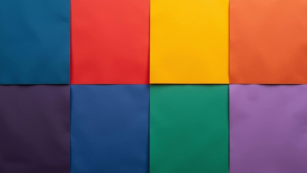
Warm Colors and Their High-Arousal Emotional Effects
Because warm hues, red, orange, and yellow, activate heightened physiological and emotional responses, they’re fundamentally distinct from their cool-color counterparts in how they shape your psychological state. Research spanning over 42,000 participants across 64 countries confirms that physiological activation and arousal from warm colors measurably increases your blood pressure and metabolism. Red triggers visceral, approach-oriented behavior and passion, while yellow generates happiness and optimism. Orange fosters social energy and community connection. The color and emotion link operates subconsciously, influencing your readiness to act before conscious thought engages.
Bright, saturated warm hues intensify these effects, making emotions associated with colors particularly potent in high-stakes contexts, from warning signs to energizing environments. Warm colors advance toward the eye due to their longer wavelengths, which contributes to their commanding presence in visual perception and their psychological impact. These consistent associations between warm colors and specific emotional states can be further strengthened when combined with other sensory cues like scents or sounds. However, excessive warm-color exposure risks overstimulation, potentially triggering tension or irritability.
Cool Colors and Their Calming Influence

While warm hues push your physiological system into overdrive, cool colors, blues, greens, and purples, operate through an opposite mechanism, systematically dampening arousal and promoting low-energy emotional states. Research across 132 studies involving 42,266 participants confirms that these colors of emotions reliably produce comfort, relaxation, and contentment.
Your physiological responses shift measurably: heart rate decreases, blood pressure drops, and brain activity subsides. Blue specifically triggers relief, while green associates with steady contentment. These emotions and colors connections reflect shorter wavelengths that your nervous system interprets as calming cues.
These color-emotion associations remain consistent across different years, countries, and cultures, demonstrating their universal psychological impact. However, it is important to recognize that causal claims about color psychology should be considered hypotheses requiring empirical validation rather than established facts.
Key mechanisms driving your emotional response:
- Visual recession creates spaciousness, lowering perceived tension
- Natural associations (water, sky, foliage) reinforce tranquility
- Consistent cross-cultural emotional meaning
- Therapeutic applications in hospitals, spas, and bedrooms
The feelings associated with colors demonstrate how cool palettes systematically influence behavior toward measured, intentional responses rather than impulsive reactions. Cool colors, such as blues and greens, are often linked to tranquility and calmness, encouraging thoughtful decision-making in various contexts, from marketing to interior design. Additionally, understanding color meanings and emotional impacts can enhance communication and foster environments that support creativity and focus. Research has shown that the impact of colors on mood can significantly alter a person’s emotional state and behavior. By strategically incorporating cool colors into spaces or branding, individuals and businesses can create atmospheres conducive to productivity and relaxation.
The Role of Metaphor and Cultural Learning in Color Meanings
You’ll find that conceptual metaphors, linguistic pairings like “feeling blue” or “seeing red”, form the scaffolding through which you unconsciously assign emotional meaning to colors, anchoring abstract feelings to concrete sensory experiences.
Your culture reinforces these metaphorical associations repeatedly through flags, religious symbols, media, and childhood learning, embedding color-emotion links so deeply that you respond to them automatically before conscious thought intervenes. Yet this process isn’t universal: while some affective patterns (black as negative, white as positive) appear across cultures, the specific emotional weight of red, danger in Western contexts but prosperity in China, demonstrates that your local history and ritual practices fundamentally shape which metaphors you internalize and activate.
Research shows that implicit measures of color-valence associations reveal these cultural differences more clearly than explicit self-reports, uncovering hidden variations in how different populations unconsciously respond to the same colors in opposing contexts.
Metaphors Shape Emotional Meaning
Conceptual metaphor theory reveals how abstract emotions become grounded in concrete sensory domains like color, spatial position, and temperature. You experience systematic mappings where metaphors like “seeing red” (anger) and “feeling blue” (sadness) create stable links between color and affective meaning.
Cultural psychology demonstrates that these associations arise partly from embodied physiological responses, flushed faces during anger, pallor in fear, providing perceptual patterns that scaffold metaphorical meaning.
Research shows metaphorical language intensifies emotional impact considerably:
- Metaphorical usages receive higher emotional ratings in 59, 84% of comparisons
- Emotional verb senses occur 3, 4× more frequently than literal counterparts
- Neurocognitive studies reveal heightened amygdala activity during metaphor comprehension
- Context sensitivity shapes how identical colors carry different emotional metaphors across domains
- Color metaphors demonstrate consistent rhetorical functions across different linguistic and cultural contexts, establishing universal patterns in how humans encode emotional meaning through chromatic symbolism.
You respond to these color-emotion metaphors subconsciously, demonstrating how cultural learning embeds abstract emotional meaning through concrete sensory experience.
Cultural Pairings Reinforce Color Associations
Because color, emotion links require stabilization through repeated cultural exposure, rituals, institutions, and language systems embed these associations into shared emotional scripts. You encounter these pairings consistently across weddings, funerals, and religious ceremonies, where specific hues signal codified emotional states.
When you wear black to a funeral or white to a wedding, you’re participating in rituals that strengthen emotional memory through repetition. Legal and institutional standards, judges’ robes, physicians’ coats, reinforce trust and authority associations. Military uniforms and school dress codes normalize particular emotional responses to limited color palettes. These systematic reinforcements operate subconsciously, shaping your intuitive reactions before conscious thought.
Research indicates that eyes can perceive up to ten million colors, yet cultural conditioning narrows which hues trigger specific emotional responses within any given society. Across ancient East Asian societies, color symbolism became deeply embedded in philosophical thought and artistic practice, demonstrating how color systems shaped worldviews across millennia. Through accumulated exposure across cultural contexts, you’ve internalized color meanings that feel natural rather than learned, though they’re fundamentally products of social convention and institutional practice.
Ecological Origins of Color Symbolism
Our color, emotion associations don’t emerge from cultural invention alone; they’re rooted in evolutionary pressures that shaped how our visual system processes the natural world. Your ancestors’ survival depended on detecting ecological cues, ripe fruits against green foliage, warning signals from predators, potential mates. These visual discriminations created deep neural preferences that persist today.
Ecological Valence Theory explains how you’ve inherited these associations:
- Red and yellow trigger approach behaviors linked to nutrient-rich foods
- Green evokes growth and fertility from vegetation recognition
- Bright warning colors signal danger across nine animal phyla
- Sexual signals leverage shared color vision for mate selection
You don’t consciously recognize these ancient survival mechanisms, yet they shape your emotional responses. Cultural reinforcement amplifies these inborn predispositions, creating layered symbolism that feels intuitive rather than learned. Color vision evolved independently across different animal groups between 400-500 million years ago, establishing the biological foundation for all subsequent color-based communication in nature.
Applying Color Psychology to Design and Environment
Understanding how colors influence perception and behavior allows designers to strategically shape user experience and decision-making. You’ll find that blue dominates web design preferences at 46%, while green and red follow at 30% and 22% respectively. Since 62, 90% of initial impressions depend on color alone, your palette choices carry substantial weight.
You can leverage industry-specific applications: healthcare professionals employ blues and greens to establish calm and trust, while finance sectors utilize green for stability and growth. Luxury brands strategically deploy purple, black, and gold to convey elegance.
When designing for diverse audiences, you must consider demographic factors. Children respond to bright primaries, whereas adults prefer subdued tones like navy and burgundy. Always test colors across devices using HEX/RGB values to guarantee consistency and adapt palettes for cultural differences.
Begin Your Healing Journey Today
Frequently Asked Questions
Can Personal Experiences or Trauma Change How I Emotionally Respond to Specific Colors?
Yes, your personal experiences and trauma fundamentally reshape how you emotionally respond to colors. When you’ve experienced trauma, your amygdala becomes hypersensitive, causing previously neutral colors to trigger fear or anxiety. If certain colors were present during stressful events, you’ll develop conditioned associations that persist. Your brain in essence learns to perceive those hues as threats. Research shows trauma survivors often shift color preferences, avoiding reds while favoring greens, demonstrating that your emotional responses aren’t fixed but malleable through experience.
Why Do Color-Emotion Associations Differ Between Individuals With Various Forms of Color Blindness?
Your color-emotion associations don’t markedly differ based on color blindness type because you rely primarily on conceptual knowledge rather than perceptual experience. Research shows that red-green color-blind individuals rate emotional responses similarly to sighted people (r = .80-.82), suggesting that you’ve internalized color meanings through language and cultural exposure throughout your life. Your brain constructs emotional associations from learned concepts, not just visual perception, making blindness type largely irrelevant to your affective responses.
How Quickly Do Color-Emotion Effects Wear off With Repeated Exposure to the Same Environment?
You’ll experience the strongest emotional impact from a color on your initial exposure, with effects diminishing through habituation. Within minutes, you’ll notice perceptual adaptation to intense color casts. Over five days of repeated daily exposure, you’ll develop rapid color constancy, achieving over 80% adaptation by day five. Your emotional response to that color context weakens considerably as your visual system re-normalizes it as background. This learned adaptation persists robustly for approximately one month.
Are Infants Born With Innate Color Preferences, or Do Associations Develop Entirely Through Learning?
You’re born with innate color preferences that emerge within your first months of life. By three months, you’ll prefer bluish hues longest, followed by reddish and purplish tones. Your brain categorizes colors into five distinct groups, red, yellow, green, blue, and purple, by four to six months, independent of language or learning. However, your preferences aren’t absolute; saturation levels and environmental statistics shape your developing color vision, suggesting both innate biology and experience jointly determine your color associations.
Can Color-Emotion Links Be Reversed or “Unlearned” Through Deliberate Reconditioning or Therapeutic Interventions?
Yes, you can reverse color-emotion links through deliberate reconditioning. Research shows that when you repeatedly pair a trigger color with positive or calming experiences, you weaken anxiety-related responses, similar to exposure therapy. Studies of Chinese stockbrokers demonstrate that extensive experience reversed red’s negative associations, transforming it into a success signal. You’re fundamentally retraining your brain’s emotional pathways through counterconditioning, proving that color meanings aren’t fixed but malleable through targeted, sustained intervention.