The Science Behind Color and Emotion
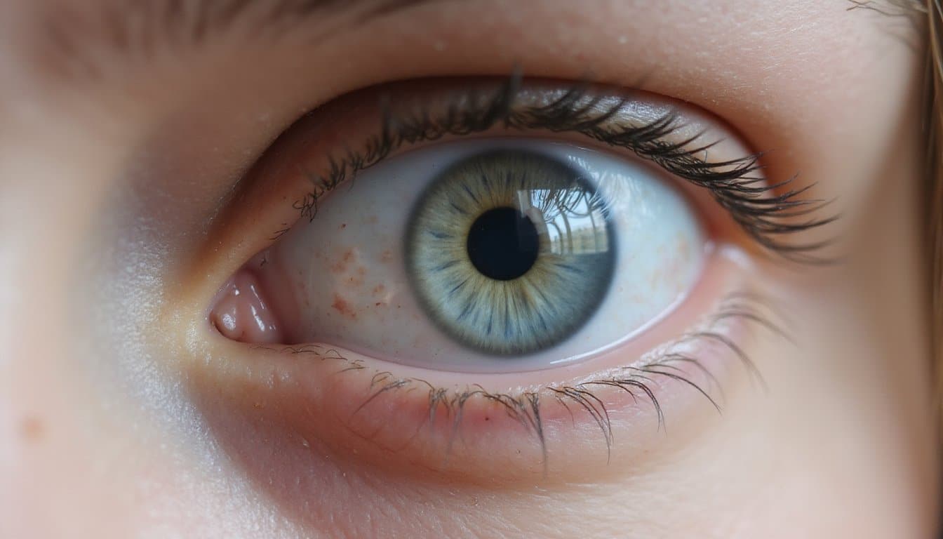
When you perceive a color, it’s not simply a visual experience, it’s a neurological cascade that links perception directly to emotion. Your cone photoreceptors detect wavelengths and transmit signals through opponent-process channels to your visual cortex and limbic regions, triggering autonomic responses like heart rate and skin conductance changes. This physiological pathway explains how colors affect mood measurably. Longer wavelengths, like reds and oranges, increase arousal, while shorter wavelengths, like blues and greens, promote relaxation.
Your right cerebral hemisphere specializes in integrating color with emotional meaning, enabling rapid affective processing. Research demonstrates that color and mood operate through systematic mechanisms: specific hues elicit predictable cognitive and behavioral patterns. These color-emotion associations have remained consistent across years, countries, and cultures, suggesting a universal biological foundation for how we respond to color. The emotional impact of color is quantifiable through regression models showing that brightness and saturation produce consistent and measurable effects across pleasure, arousal, and dominance dimensions.
Understanding this neurobiology reveals how color mood effects aren’t random but rather biologically grounded processes shaping your emotional responses continuously.
Red: The Color of High-Energy Emotions
Because red wavelengths trigger the strongest physiological responses among all visible colors, they’ve become synonymous with high-energy emotional states that demand your attention and accelerate your body’s arousal systems. Research demonstrates that red exposure increases your heart rate, elevates adrenaline, and enhances alertness through heightened arousal & physiological activation. This stimulation can also increase food consumption and trigger competitive urgency in various contexts.
You’ll experience red’s emotional complexity across multiple domains. It amplifies passion, desire, and attraction, intensifying romantic perceptions and priming desire-related thoughts. Simultaneously, red activates anger, aggression, and risk-taking impulses, reducing deliberative thinking and encouraging reactive behavior. The color also strengthens power, dominance, and competitiveness, fostering feelings of control and triumph in competitive contexts. These emotional responses can vary significantly depending on cultural differences and personal experiences that shape individual color perception.
Your brain processes red as an urgent signal, one that simultaneously mobilizes motivation and heightens vigilance across emotional and behavioral systems.
Yellow and Orange: Warmth and Positivity
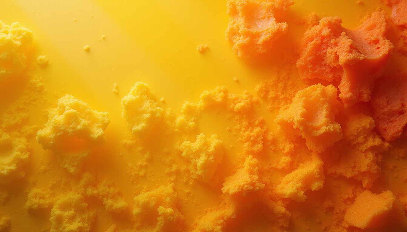
Yellow and orange occupy a distinct category within color psychology as warm hues that reliably trigger feelings of cheerfulness, energy, and optimism. These colors interact with your emotional processing systems, stimulating both mood elevation and mental activity.
Yellow’s association with intellect and productivity makes it particularly effective for enhancing focus and motivation, though excessive intensity can provoke overstimulation and anxiety. Orange combines yellow’s optimism with energetic properties, promoting social engagement and creativity without red’s aggressive undertones. Understanding mood regulation through these warm tones allows you to strategically deploy them in environments where you need psychological warmth.
Orange’s positive psychological effects include decreased irritability and improved social behavior when used thoughtfully in your living spaces. The key lies in balancing saturation and intensity, softer yellows create inviting spaces, while vibrant oranges inspire action. Children and elderly individuals demonstrate heightened sensitivity to color, making careful selection of warm tones even more critical in shared or multi-generational spaces. Your emotional states respond predictably to these hues when applied thoughtfully.
Blue and Green: Calm and Restoration
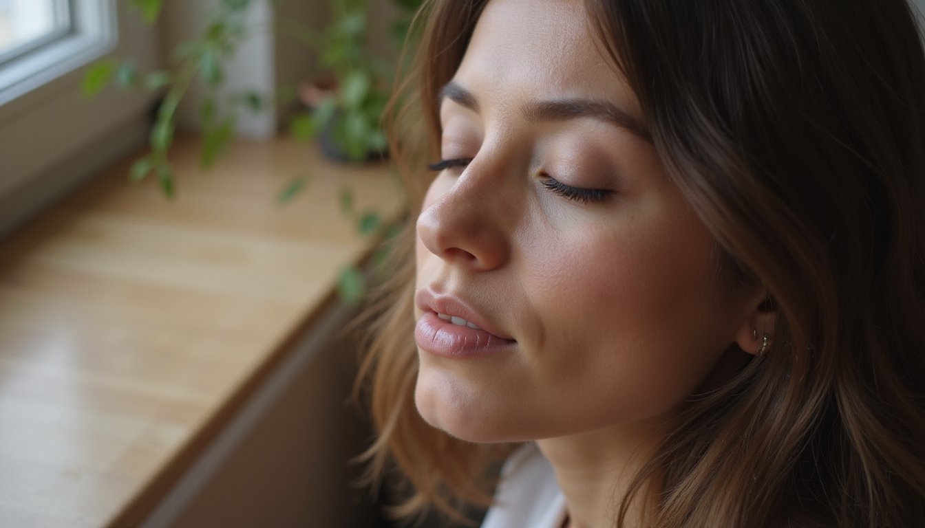
When you’re exposed to blue and green environments, your body responds with measurable physiological shifts, lower blood pressure, reduced heart rate, and decreased cortisol levels that signal genuine relaxation rather than mere perception.
You’ll find these colors restore mental balance by supporting focus and cognitive clarity, making them particularly effective in spaces designed for concentration or recovery. Designers and therapists strategically apply blues and greens in bedrooms, healthcare settings, and workspaces to harness these calming and restorative effects, anchoring the connection between color choice and emotional wellness in evidence-based practice.
Green’s particular effectiveness in healthcare environments stems from its proven ability to reduce anxiety and stress, creating safer spaces for patient recovery and healing. These color preferences have evolutionary roots that explain why humans instinctively respond to natural blues and greens found in water and vegetation.
Physiological Calming Effects
As your eyes take in blue and green hues, your nervous system undergoes measurable shifts toward relaxation. Blue-green parasympathetic activation engages your dorsal vagal complex, moving you from fight-or-flight arousal to a state of calm presence. This neurobiological response produces tangible physiological changes:
- Heart rate and blood pressure decrease in blue environments
- Anxiety levels drop compared to red or yellow conditions
- Amygdala activity downregulates, reducing chronic stress responses
- Nucleus accumbens activation enhances positive mood states
Blue physiological responses extend beyond subjective comfort, research consistently documents lower cardiovascular stress markers and elevated relaxation reports. Green exposure compounds these effects through stress reduction pathways, lowering mental distress probability. The paraventricular nucleus of the hypothalamus serves as a central regulatory hub that coordinates these stress response mechanisms and maintains homeostasis throughout the body.
Integrating green elements into your practice space can foster a sustained sense of calm and well-being through nature’s restorative properties. Together, these wavelengths (490-520 nm) facilitate your body’s recovery mechanisms, supporting immune function and emotional regulation through measurable neural integration.
Restoration and Mental Balance
Beyond immediate physiological shifts, blue and green wavelengths support deeper restoration by engaging your brain’s emotional regulation networks. When you’re exposed to blue-green hues, you’re activating neural systems that balance threat detection and reward processing, a mechanism affective science demonstrates supports recovery from chronic stress.
Green’s association with nature reinforces renewal narratives, while blue promotes mental clarity and reduced cognitive fatigue. Together, they create conditions for psychological regrouping and mental reset. This blue-green spectrum functions as an “emotional regulator,” smoothing limbic reactivity and supporting internal stability.
By reducing sensory overload and mental clutter, these colors facilitate deeper emotional well-being and sustained mental well-being. Research shows that color’s neurological basis explains why individuals experience consistent emotional responses across diverse populations. Additionally, the impact of colors on human behavior can be observed in various settings, from homes to workplaces, influencing productivity and mood. By carefully selecting color palettes, individuals can create environments that foster positivity and mindfulness.
The result is integration rather than suppression, your nervous system downshifts toward calm while maintaining psychological equilibrium. These complementary approaches work most effectively when paired with mindfulness and somatic practices to anchor therapeutic insights and create multi-sensory experiences that support lasting change.
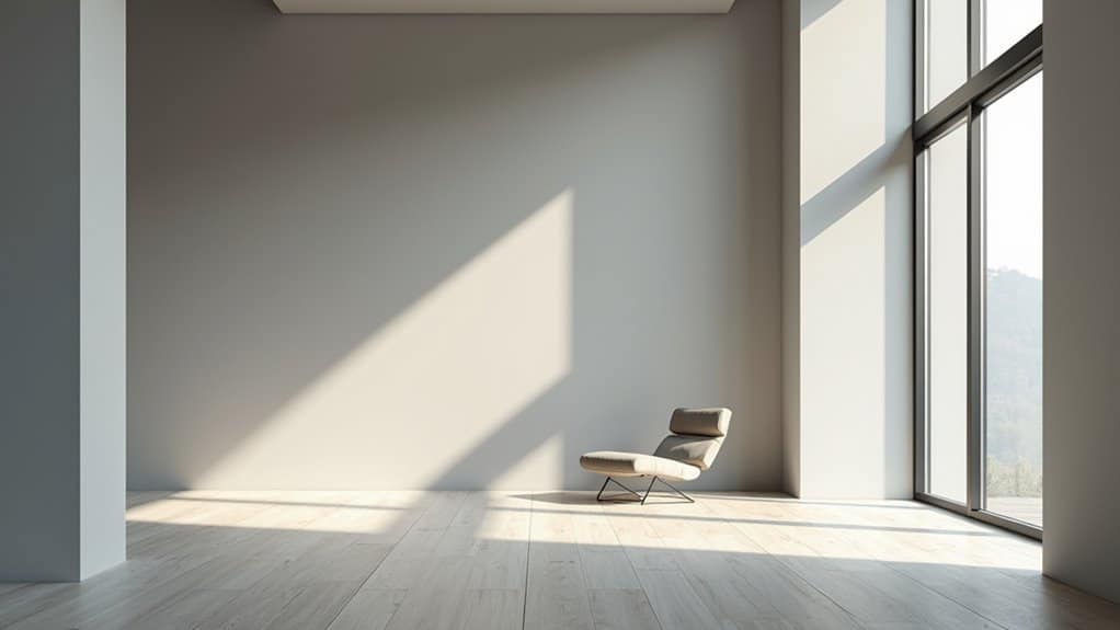
Environmental Applications for Wellness
The restorative potential of blue and green extends directly into the spaces where you live, work, and seek treatment, a principle known as biophilic design that deliberately incorporates natural color palettes into built environments. When you’re exposed to these hues, you experience measurable physiological shifts:
- Green slows your metabolism through shorter wavelengths, reducing eye strain and promoting calm
- Blue induces serenity, evoking associations with clean water and clear skies
- Natural light amplifies these colors affect mood responses in wellness environments
- Plant-integrated spaces reduce loneliness while boosting enthusiasm and well-being
Healthcare facilities, offices, and therapeutic settings strategically deploy these color moods to enhance problem-solving and tranquility. You’ll find greens in meditation spaces for nature connection and blues in healthcare design for peace.
This evidence-based approach transforms environments into restorative sanctuaries, leveraging evolutionary associations that make your brain respond favorably to natural color cues. Incorporating fractals and repeating patterns found in nature further enhances these calming effects by reducing stress and promoting tranquility.
Monotonous color schemes in these spaces can undermine their therapeutic potential, while balanced visual complexity similar to natural environments supports sustained well-being and reduces stress responses.
Black and Gray: Understanding Negative Associations
When you’re exposed to black and gray environments, your brain responds to darkness through both physiological mechanisms, like reduced light stimulation affecting circadian rhythms, and learned associations shaped by cultural symbolism and personal experience.
You’ll find that design applications must account for context; while black conveys sophistication in fashion or branding, prolonged exposure in living spaces correlates with elevated anxiety and depression scores in clinical populations. Strategic use of these colors requires balancing their psychological weight against functional purposes, since what you perceive as elegant restraint in small doses can become oppressive or emotionally depleting at scale.
Physiological Responses to Darkness
Because your body’s circadian system evolved under natural light, dark cycles, prolonged or constant darkness disrupts fundamental biological rhythms that govern sleep, mood, and metabolic function. Extended dark exposure triggers measurable physiological changes:
- Melatonin dysregulation: Your morning melatonin levels rise while nighttime levels decrease, converging within 10 days and destabilizing sleep, wake patterns.
- Serotonin reduction: Decreased light exposure lowers serotonin activity, directly contributing to depressive states and low energy.
- Metabolic disruption: Abnormal light, dark cycles impair glucose processing and increase fat deposition, raising obesity and diabetes risk.
- Cardiovascular stress: Altered circadian rhythms elevate blood pressure and cardiovascular disease risk through disrupted nitric oxide signaling.
These physiological responses demonstrate how colors’ effect on mood extends beyond psychology, darkness creates systemic biological stress that amplifies existing emotional vulnerabilities.
Cultural and Contextual Meanings
While biological responses to darkness establish a physiological foundation for mood effects, cultural symbolism amplifies and structures how we emotionally interpret black and gray. Your everyday language reveals these deeply embedded associations: you describe depression as a “black mood” and uncertainty as feeling “gray.”
Black historically signified mourning, death, and moral corruption across Western traditions, while gray represented poverty, austerity, and emotional flatness. Research demonstrates that greater gray usage in self-portraits correlates with depressive tendencies. Yet context matters substantially. You’ll recognize black as authoritative in business attire or formal settings, while gray conveys neutrality and objectivity.
These colors and moods aren’t inherently linked, rather, your cultural conditioning shapes emotional responses. Understanding these associations helps you recognize how symbolic meanings influence your psychological reactions to environmental color choices. By exploring the nuances of different colors and their psychological impacts, you can harness their power to evoke specific emotions or create desired atmospheres in your surroundings. Understanding color psychology allows individuals to make more informed decisions in areas such as design, marketing, and personal expression.
Design Applications and Avoidance
Understanding how black and gray function in design requires acknowledging their dual nature: they’re powerful tools for establishing hierarchy and sophistication, yet they’re equally capable of amplifying negative emotional states when overused. Research demonstrates that does color affect mood, particularly through prolonged exposure to dark neutrals, which can trigger isolation and fatigue.
Strategic deployment mitigates risk:
- Use black sparingly for typography and calls-to-action to emphasize hierarchy without creating oppressive atmospheres
- Apply warm-tinted grays as stabilizing backgrounds, reducing coldness perceptions
- Pair dark schemes with contrasting accents to maintain visual engagement and emotional balance
- Reserve black for luxury branding contexts where authority conveys intentional sophistication
Evidence-based design recognizes that excessive dark neutral exposure correlates with decreased arousal and increased depressive associations. Balanced implementation preserves these colors’ professional strengths while protecting user emotional well-being.
How Lightness and Saturation Shape Emotional Responses
Two key dimensions of color, lightness and saturation, powerfully modulate how you experience emotional intensity and valence. When you’re exposed to brighter colors, your emotional perception shifts toward positive states, as lighter hues consistently trigger higher valence ratings. Conversely, darker colors amplify physiological arousal by increasing your heart rate and decreasing heart rate variability, creating more intense emotional responses overall.
Saturation intensifies these effects dramatically. Highly saturated colors elevate your skin conductance responses and amplify pleasure alongside arousal. However, when saturation decreases by just 50%, your pleasure noticeably diminishes in positive imagery. The interaction between these dimensions proves essential, bright, saturated combinations yield the strongest positive valence, while muted tones dampen emotional intensity regardless of hue, allowing you greater emotional regulation through strategic color choice.
Cultural Differences and Personal Color Preferences
Your emotional response to color doesn’t exist in a vacuum, it’s shaped profoundly by the cultural meanings attached to specific hues and your individual history with them. Research demonstrates that mood colors vary dramatically across cultures. Consider these patterns:
Your emotional response to color isn’t universal, it’s shaped by cultural meanings and your individual history with specific hues.
- Red signals luck and celebration in Chinese contexts but danger in Western settings
- White represents purity in many Western cultures yet symbolizes mourning in East Asian traditions
- Blue ranks highly across regions, though preference intensity differs greatly by country
- Gender preferences themselves fluctuate culturally, Arabic females favor red-pink while English females prefer blue-green
Your personal biography compounds these cultural influences. Childhood environments, significant life events, and physiological traits like skin tone all calibrate your color preferences. These factors work synergistically, making your mood response to specific hues uniquely yours while remaining anchored in broader cultural frameworks.
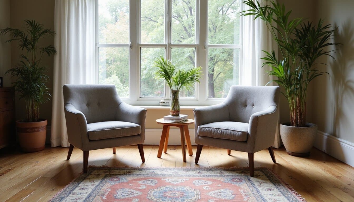
Practical Applications for Designing Mood-Enhancing Spaces
While cultural and personal factors shape how you respond to color, the principles of color psychology offer concrete strategies for designing spaces that actively support your emotional wellbeing. You can strategically apply color theory to different zones, balancing warm and cool palettes to regulate arousal levels throughout your environment.
| Room Type | Recommended Colors | Mood Effect |
|---|---|---|
| Bedroom | Cool blues, soft greens | Reduces stress, promotes sleep |
| Home office | Blues, greens with accents | Enhances focus and concentration |
| Living area | Warm earth tones, soft yellows | Increases sociability and relaxation |
| Kitchen | Yellow, warm neutrals | Stimulates appetite and alertness |
| Exercise zone | Red, orange accents | Elevates motivation and energy |
You’ll notice how does color affect mood depends on saturation and value. Low-saturation pastels calm visual fatigue, while high-contrast schemes sharpen alertness. Deploy intense warm colors across only 10, 20% of visible surfaces to maintain energy without overstimulation, creating shifts that naturally downregulate your nervous system. Incorporating these color strategies can be particularly beneficial in environments designed for mental health treatment services. For instance, spaces where individuals seek support can utilize calming tones to foster a sense of safety and tranquility. Ultimately, the careful application of color not only enhances aesthetic appeal but also significantly contributes to emotional well-being.
Take Charge of Your Mental Health Today
Frequently Asked Questions
Can Color Preferences Change Over Time Due to Life Experiences or Emotional Shifts?
Yes, your color preferences shift substantially over time through life experiences and emotional changes. Research shows you develop color associations based on objects you’ve repeatedly encountered, your brain’s reward system strengthens these connections. When you’re exposed to desirable red objects, you’ll prefer red more. Seasonal environmental changes also reshape your preferences; you’d favor warmer, darker tones in autumn. Your individual reward sensitivity and motivations further influence these preference shifts, making color preferences genuinely malleable throughout your lifetime.
Why Do Some People Have Negative Reactions to Colors Typically Considered Positive?
Your negative reactions to “positive” colors stem from three interconnected factors. You might’ve developed cultural associations that contradict Western symbolism, white signifies mourning in your background, for instance. Personal trauma can condition you to fear colors linked to distressing memories; yellow in a bullying space becomes anxiety-triggering. Finally, you’re biologically sensitive to overstimulating warm hues, experiencing red’s arousal as agitation rather than energy. Your individual neurobiology and history override generic color psychology.
How Quickly Do Colors Affect Mood, Is the Impact Immediate or Gradual?
You experience color’s emotional impact in milliseconds to seconds, your visual system and emotion-processing brain regions respond almost instantaneously. You’ll notice mood shifts within minutes of exposure to colored environments. However, you’ll likely adapt over days to weeks through habituation, where initial strong reactions diminish. Your personal history, cultural background, and current emotional state moderate how quickly you respond, making the timeline highly individual and context-dependent.
Are There Specific Colors That Help With Diagnosed Mental Health Conditions Like Depression?
You’ll find the strongest evidence for bright white or blue-enriched light therapy treating seasonal affective disorder, with 40, 60% clinical response rates. For depression broadly, warm colors like yellow may boost perceived energy, while blues and greens reportedly reduce stress markers, though effects remain modest and highly individual. You shouldn’t rely on color alone; it’s an adjunct to evidence-based treatments. Your personal color preferences matter considerably, so you’ll benefit most from identifying which hues genuinely energize or calm you.
Can Color Combinations Create Different Emotional Effects Than Individual Colors Alone?
Yes, color combinations create emotional effects you won’t predict from individual colors alone. When you pair hues together, harmony and contrast trigger distinct psychological responses, secondary color schemes elicit more positive emotions than primary combinations, despite individual colors’ associations. You’ll experience heightened arousal with high-contrast pairs like blue-orange, while harmonious mixes produce comfort. Warm-cool blends balance arousal and calm, generating blended states like “energized yet safe.” Your emotional response emerges from the combination’s overall organization, not its isolated components.